By now, you probably know how important it is to have a website for your small business.
(And if you don’t have one already, then stop right there and go check out these tips and actionable steps on how to create a small business website.)
But sometimes just having a website isn’t enough — you need a good website. One that impresses visitors and keeps them coming back, looks amazing no matter what device you are on, and makes it easy for customers to make a purchase.
That was the case for Dawn Noble, owner of La Provence — a small retail store in Rockport, MA. La Provence is an importer of French goods such as tablecloths, soaps, kitchen goods, and more. Dawn had a website for La Provence but it wasn’t living up to her expectations nor was it an accurate digital representation of her business.
Want to see the full story of how we worked with Dawn to transform her small business’s online marketing. Start with our article Making Sense of Online Marketing for a Real Small Business
How do you know when your business website needs an upgrade?
Dawn’s original website was doing the bare minimum for her small business.
While customers could shop online, the website wasn’t mobile-responsive and was hard to read on a small device. Potential customers could see her hours and address, but they had no idea what the story was behind La Provence or why they should shop there. Her email list and social accounts lacked the promotion they deserved.
There were also several pain points that made it so that Dawn saw working on her website as a chore rather than an opportunity. For example, adding new products to her online store was a very manual process that required a lot of time and effort. She had built her site on a platform that was hard to access, using a bunch of lingo she didn’t understand and wasn’t able to easily integrate some of her other online marketing tools.
And, maybe more than anything, her website didn’t portray the incredible whimsy of her store. When you walk into La Provence’s brick-and-mortar store, you’re immediately drawn in by the smells, colors, and quaintness of the building itself.

But when you visited La Provence’s website? Well, it wasn’t nearly as inviting and attractive.

It was clearly time for a change. But, where to start?
How to upgrade your website

We chatted with Dawn and offered to help give her online marketing a makeover.
Using the knowledge and know-how in our free guide for retail businesses, The Download, as our basis, we helped Dawn take each step she needed to get her online marketing up to snuff in no time. First on that list? Her website.
1. Make sure your website is mobile-friendly
As consumers increasingly turn to their mobile phones to make purchases and research companies they are interested in, it is more important than ever to make sure your website looks great on any device. In fact, M-commerce — the name given to ecommerce activity that takes place on a mobile device — is projected to reach 45% of the total U.S. ecommerce market by this year, according to BI Intelligence.
Due to Dawn’s website lacking the mobile responsive features which allow users to easily make a purchase from their phone, she may have been missing out on potential sales (and if your website isn’t mobile-responsive, you may be, too!)

Luckily, Constant Contact’s website builder makes sure that your website looks great no matter what device it is viewed on. From small cell phones to a medium-sized tablet, your site will always appear at its best.
Once we created the basis for Dawn’s website by answering a few questions such as her business category and general appearance options, it was time to start filling out the content.

2. Make sure your website has at least four pages
When people visit a website, they are often looking for answers to questions they may have about the business. We used the following pages for La Provence’s website redesign, chosen to answer common questions a visitor may have:
Homepage
Your homepage is the front door of your website. It is important that your homepage really brings your brand to life and evokes the emotion you want a visitor to feel toward your business. It’s unlikely that when Dawn created her original website, she was hoping to drive people away! However, the bright color choices and confusing layout did just that.
Use your homepage to answer questions such as “What does your business offer?” and “Who is your business for?” It’s also important to tell visitors what they should do next and why they should care about your business or mission.


Finally, if a visitor isn’t quite ready to shop, the email sign-up form at the bottom shows customers what to do next.
About page
One thing we should mention about Dawn is that she is not the type to talk about herself.
If you want to talk about Rockport, she can keep you busy for hours talking about the area, how she worked in a restaurant down the street before becoming a business owner, or how the business owner next door is her daily coffee buddy. But when it comes to showcasing herself or her own talent, forget about it.
In fact, I bet she’s blushing right now even just reading this! (Hi, Dawn!)
One of the first things I did when revamping La Provence’s website was add a photo of Dawn smiling behind the counter…
…and one of the first things Dawn did when she got access to the new site was replace it with a beautiful photo of her open sign on the front door.

Telling your story helps to put a face behind the company. Suddenly, your store is no longer just a business; it’s a success story of how you got started and what your work means to you.
And while showcasing photos of yourself, your team, and your location are all great ways to share that story, if you’re like Dawn — feel free to leave yourself out of the equation.
Your About page doesn’t need to feel self-centered or flashy. Instead, use this space to tell your story, explain why people should care about your business, and outline things that make you stand out from your competition. Including testimonials on this page is a great way to show why others love you, instead of tooting your own horn.
Products page
If you’re a business owner, you need to, well, sell things. Otherwise, you probably won’t be open for long.
The Products page of your website should clearly outline the items or services that you offer, how a visitor can make a purchase, the details of the item (such as weight, dimensions, care instructions, etc.) and pricing.

After all, you don’t want to cause a situation like this person had when they ordered a “scratching post” for their cat from a listing that didn’t include dimensions…
A straight-forward, honest experience is always best when it comes to online retail. Make sure that your visitors get the full picture (literally) on what they are ordering and how much it will cost.
For Dawn’s site, we broke her inventory down into categories such as ‘French soaps,’ ‘French pantry,’ and ‘Teflon tablecloths’ to make it easy for visitors to see what they are looking for.

Using this item as an example, you can see that Dawn has added a description of the item that includes material, washing instructions, and dimensions. This particular item also comes in sets of 4, 6, 8, 10, or 12, so Dawn has added this as a drop-down option.
The more information you can provide a potential customer with, the better.
Contact page
It shouldn’t be difficult for someone visiting your page to learn how to contact your business.
The first question to answer is where can people find you? For Dawn, that means making sure that her physical store address is listed online, including a map that links to Google Maps for easy directions.
The next question is when can people find you? Make sure that your store hours are clearly listed on your website. There are few things more off-putting for a prospective customer than when they check your hours online and expect you to be open, yet when they show up they are faced with a locked door. Manage expectations on when you are open right from the start to avoid less than stellar experiences that may keep people from coming back again.
Finally, how can people contact you? In addition to basics such as phone number and email address, be sure to list your social media accounts, with links, so people can connect with you on social media as well.
3. Use up-to-date and on-brand imagery
Have you recently renovated your store? Maybe added a fresh coat of paint to the front or changed out the door?
It is key to make sure the imagery on your website reflects the current state of your store. The last thing you want is someone to visit your shop and leave because it doesn’t look like the place they saw online.
This applies to your business’ branding as well. If you update your logo or change your color palette, your website should reflect these changes.
Poor website photos paired with even the best design will give your website an unprofessional feel. By using a few high-quality message-driven images on your website, visitors will better understand what your business is about, what you want them to do next and why they should purchase from you.
4. Use your website to cultivate long-term relationships with visitors who may not make a purchase right away
Let’s face it — not every person who visits your site is going to make a purchase. At least, not right away. Or in some cases, not ever.
But even if they never visit your website again, there are ways to keep in touch.
Using your email marketing sign-up form to gather customer contact information allows you to reach out to them again in the future when you have a sale, event, or new items that they may be interested in.
Remember- Your website is at the center of your online marketing efforts
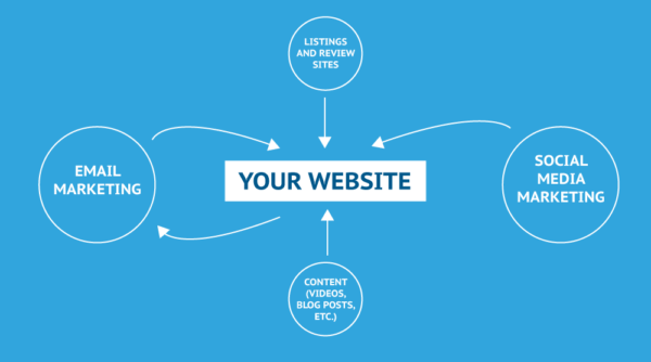
While your website is only one component of your online marketing mix, it is absolutely key to all of your online marketing efforts. Keep your website’s role in mind when planning, designing, or updating it.
Put yourself in a visitor’s shoes — are they arriving to your site after clicking an ad? Maybe they discovered you from a Google search, or maybe they clicked a link in one of your emails. Think about what action you’d like each type of visitor to take and then make that action as simple as possible on your site.
Updating Dawn’s website is just the beginning of our online marketing makeover
Keep an eye out for the next step in this series where we discuss how we optimized Dawn’s email marketing campaigns.
Have you missed a step in our marketing makeover with La Provence? Check out our announcement post so you can catch up.
The post The Download in Action: A Mobile-Friendly Retail Website appeared first on Constant Contact.