It’s often challenging to navigate the information overload you experience, thanks to the never-ending updates from social media, news, and emails.
Subscribing to the right email newsletter ensures you get the information you need in your inbox. Like a hot knife through butter, the best email newsletters help you cut through the clutter to ensure you don’t miss out on anything important.
This blog post provides tips and tricks for creating a newsletter that delivers value to subscribers. I also include examples of exemplary newsletters and explain what makes them work.
The curation serves to level up the journalistic quality of your content, which results in two things:
- Increases the value you provide.
- Improves your authority and credibility in your audience’s eyes.
While newsletters and email marketing can be effective, many newsletters flop.
These newsletters become an uninteresting mush of content people automatically ignore, archive, delete, or straight up unsubscribe from. And this isn’t great for you, your metrics, or your company’s success.
So, if you’re considering creating an email newsletter, keep reading. In this post, we’ll cover:
- Email Newsletter Ideas
- Email Newsletter Design
- 21 Top Email Newsletter Examples
Email Newsletter Ideas
Email newsletters can include a weekly round-up of blog posts, case studies regarding your product or service, upcoming company events and webinars, or even a behind-the-scenes look at your company.
Of course, you don’t want to create a newsletter just to create one — instead, you should thoroughly research what your audience might prefer and what your company is well-suited to offer.
You’re in luck if you’re looking for inspiration for a general email newsletter. Here’s a list of some of our favorite ideas for email newsletters:
- Round-up of popular or recent blog posts or videos.
- New job openings at your company.
- New case studies or product launches.
- Membership/customer deals and promotions.
- New best practices or tips.
- Industry news.
- Quotes.
- Recent survey results related to your industry.
- Internal employee news, including anniversaries, promotions, and birthdays.
- Listicles (e.g., “10 Best Vacation Spots of 2020” if you work for a travel publication).
- A team spotlight with pictures and bios.
- Photos or stories customers have shared.
- Behind the scenes at your company or interviews with company executives.
- Monthly business recap.
- New training opportunities.
- Frequently Asked Questions (FAQs) and Answers.
- Upcoming webinars or recordings of past webinars.
Let’s now explore some newsletter designs to inspire the aesthetic of your newsletter.
Featured Guide: Email Newsletter Design Examples Lookbook
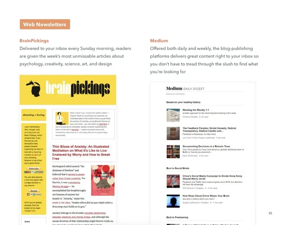
Image Source
This free guide teaches you how to build an email newsletter from scratch and includes dozens of examples from real businesses.
Email Newsletter Design
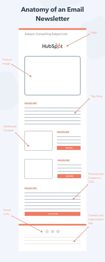
While you can get creative with the structure of your email newsletter, the general anatomy typically includes:
- Your logo or masthead.
- A featured image and other eye-catching visuals.
- Top stories.
- Additional content and promotions following.
- An email footer with social links and subscription information.
From a design standpoint, your company’s newsletter should truly reflect your brand.
For instance, if your website features a minimalist design and clean, plain black-and-white text, you want to avoid creating a super colorful newsletter, which might confuse new subscribers.
However, there are a few best practices you can employ to ensure your design is up to par regardless of your audience’s preferences:
- Clean, crisp images (no blurry images).
- Text (use same text throughout), company logo, and icons.
- Try filters, memes, or videos.
- Make the call-to-action (CTA) clear and obvious — and just have one (e.g., “Click here to shop” or “Click here to read”).
- Create a hierarchy with a CTA early on.
- Mobile-responsive.
- Test the length of your newsletter to ensure it’s not too short or too long for your audience.
Of course, the design of your newsletter will depend on your brand, as well as the message.
For instance, if your newsletter primarily focuses on visuals of new products, you should create a colorful, attention-grabbing newsletter. Alternatively, if it’s a round-up of recent blog posts, you could try a more minimalist look to mimic the appearance of a letter.
You should A/B test whichever design(s) you choose to ensure they resonate with your audience.
If you’re unfamiliar with designing emails, I recommend looking into pre-made templates. If you’re a HubSpot customer, the email tool will have a bunch of pre-made templates.
However, if you still need to figure out your newsletter design, there’s nothing better than looking at examples for further inspiration.
Take a look at the following newsletters that were outstanding, and consider using some of their design elements as inspiration for your own.
 21 Top Email Newsletter Examples
Each newsletter on this list works for different reasons. Some have exceptional design, some have exceptional copy, and some have exceptional CTAs, but all are exceptional at satisfying their subscribers’ needs.
1. The Hustle
The Hustle is a daily newsletter that promises “business and tech in 5 minutes or less.”
While there are many business and tech newsletters out there, what makes The Hustle remarkable is its tone, which is at the intersection of information and humor.
Take two recent headlines as an example:
- “The con man who sold the Eiffel Tower — twice.”
- “Why you almost never see the clock at the mall.”
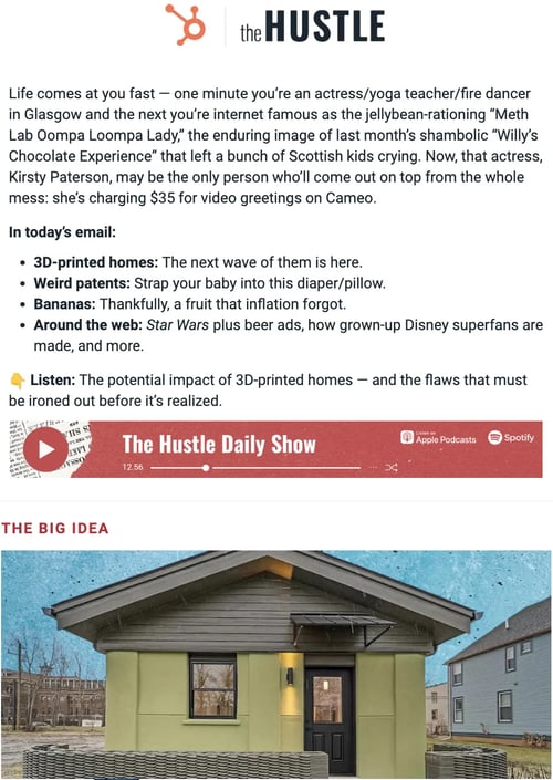
Image Source
What I like: Despite targeting the business and tech audience, The Hustle often uses informal language such as “dude” or “damn” in its newsletter. I love this informal tone! I feel connected to the news and the writers. Plus, puns and witty humor in the headings and content make this email newsletter the favorite of startups and entrepreneurs.
The Hustle also allows subscribers to customize the content they receive to fit their interests.
Most of The Hustle’s readers hope to scale their startups or are looking for a business idea. The witty tone blended with knowledgeable insights makes it one of this competitive niche’s most influential and most-read email newsletters.
Further, the newsletter is structured with the best stories at the top. And the best part: The stories start with captivating titles.
The formula of great content + unique tone + personalization works well for The Hustle’s audience as they’ve grown to more than 2.5 million subscribers.
The Hustle stands out from others in its style and unique content. It doesn’t target only startups and entrepreneurs but has also grabbed massive eyeballs from company execs, growth managers, salespeople, and marketers.
Best for: That said, it isn’t just limited to the tech niche. SaaS businesses can also imitate this type of email newsletter to address industry problems, potential solutions, and benefits to reach out to the masses.
2. Atlas Obscura
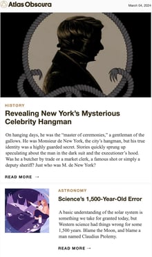
Image Source
Atlas Obscura’s newsletter provides more than travel recommendations—it also delivers compelling stories about the world to your inbox.
Atlas Obscura is a perfect email newsletter guide for frequent travelers who want to explore off-beat locations around the globe.
What I like: I love a scary story, weird fun fact, or creepypasta. With stories like “Spotting Squid in the Tides of Oahu” and “Dreaming of Spaghetti and the Sea,” the Atlas Obscura newsletter is a portal for exploration.
They do an excellent job of writing attention-grabbing headlines and finding unexpected, delightful details — library apartments, haunted coffee, and 19th-century skulls are just a few examples.
Their unique value proposition lies in the quirky subject and the short but captivating headlines like “Deadly Shortcuts” and “World’s Oldest Edible Ham.”
What’s most appealing about this newsletter is the style and story plots. I know I’m in for a treat, and I never get bored exploring these mysterious travel tales.
Combining interesting stories, captivating photos, and incredible destinations, the Atlas Obscura newsletter reels me in.
Along with the exciting content it covers, Atlas Obscura is unique in its flexibility in choosing newsletter types. The site offers six different types of newsletters, including weekly, daily, or twice-weekly.
It’s a win-win situation for both the readers and the newsletter provider.
Best for: Atlas Obscura is a great inspiration for businesses with large audiences and a wide variety of topics to cover. Notice how they have categorized the topics based on locations, archives, and even podcasts.
Businesses covering such large topics can segment their audiences by allowing them to navigate the resources they want to read.
3. Buffer
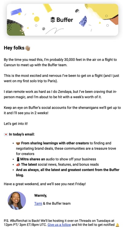
Buffer does a great job at keeping the newsletter concise, making it easy for readers to get the knowledge they need with a skim.
They understand that readers want to catch up on the fast-paced and ever-changing social media landscape, so they break down the newsletter into easily navigable sections and short phrases.
What I like: The newsletter is packed with information without feeling overwhelming due to its simple and organized structure.
One thing worth noticing is its simple yet powerful design. At the core, it has a white background with basic fonts that are spaced and include bullets.
Furthermore, Buffer’s newly revamped email newsletter has a short yet powerful intro that covers an index of what’s included in this email.
Another noteworthy thing is their “zero-click content.” Instead of summarizing various topics with a “Read More” CTA, the email shares a single cover story with a large description and a CTA that says “Dive Deeper.” It’s a great way to interest your readers in a single topic instead of distracting them with multiple blog posts.
What’s most effective is their social media manager’s advice at the end that most businesses will love to turn their attention to.
Buffer’s newsletter is a perfect example of how to gain more subscribers using a simple design but powerful content and structure.
Best for: SaaS businesses that want to bring their visitors to their blogs can look up to Buffer’s newsletter strategy. Moreover, the latest trends and industry insights can interest the readers in further reading.
4. The Washington Post The 7
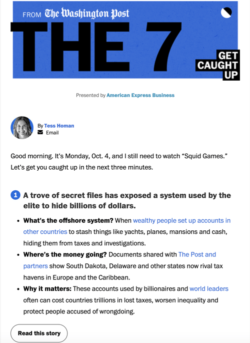
Image Source
The news is overwhelming, and trying to scroll through Twitter to catch up on what’s happening can lead to distractions. The Washington Post understands this and created “The 7” to break down the seven most important stories of the day.
The idea of the two supposed “dead media” — news and email — coming together to deliver something valuable makes this newsletter worth reading.
What I like: Like everyone else, I’m busy. I don’t always have the time to pursue the Washington Post’s home page (let alone a physical newspaper). With this newsletter, I get exactly seven stories sent to my inbox every weekday morning. And it takes merely three minutes to cover this 400-word newsletter.
The listicle format makes the newsletter skimmable. Under each story, they include bulleted points like “why this matters,” “why now,” and “the numbers” to get the point across succinctly. Complex news is made digestible.
I love The 7’s short yet informative and detailed articles. What sets this newsletter apart from others is its end goal, which is to get more readers to consume the content from the newsletter instead of jumping on the site.
Lastly, the heavy heading texts followed by thin fonts and a clear CTA make this newsletter sober yet effective.
Best for: Newsletters focused on delivering succinct content to their readers should follow this example. Whether news, blog posts, or stories, making your content easily digestible is vital for a successful newsletter.
5. Why We Buy
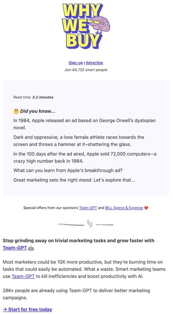
Image Source
Why We Buy is a biweekly (twice a week) newsletter in which “Customer Whisperer” Katelyn Bourgoin shares tips that help marketers understand buyer psychology.
The newsletter comes across as fun and engaging, with real-life examples and scenarios from brands most people are familiar with.
What I like: Each newsletter edition is bite-sized. I finished reading it in less than four minutes. In those few minutes, readers learn one core thing about their customers that’d help improve their marketing efforts.
Best for: Marketers and business owners who want to sell more by truly understanding the science behind what makes people buy things.
6. The New York Times Cooking
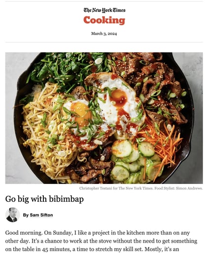
A picture is worth a thousand words, says the adage. This couldn’t be truer for newsletters — if your content lends itself to imagery, use it to your advantage, like The New York Times Cooking newsletter.
The New York Times may be known for delivering news, but it also has a robust cooking section packed with creative, multicultural recipes that are beautifully photographed.
Highlighting new recipes from different chefs, The New York Times Cooking newsletter is always fresh. They expertly include a variety of recipes so readers get value out of finding something new to try.
What I like: I love a good recipe. But with so many sites out there and so many types of cuisine, making a choice can sometimes feel like a burden. The New York Times Cooking offers a curated option that always keeps me inspired.
When I open the newsletter, I’m welcomed with a mouth-watering image that will entice you to scroll down further. Plus, the clean and uncluttered design makes reading more skimmable.
The lengthy blog text is engaging, personal, and conversational for the readers. However, the newsletter is shorter than other similar magazine newsletters. This email newsletter wins in its yummy visuals and enriching content.
Best for: This newsletter styling is perfect for businesses that engage with their readers using more visuals than text. For instance, a graphic design or fashion company may want to display more visuals and appealing elements than text.
7. Quartz Daily Brief
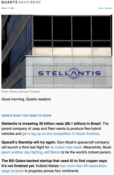
Image Source
What I like: The newsletter is straightforward, like a brief, without being dry, and it uses visuals like charts to help pique the reader’s interest.
Sections for need-to-know news, what to watch for, top reads, and surprising discoveries keep things organized. The breadth of material means I can choose from various topics to investigate further.
Though the newsletter has limited visuals, I never find it dry or boring. What differentiates it from similar newsletters is the lack of index or heavy-font headlines.
Yet that doesn’t turn away the reader. The same-sized but bold text points out that the stories are addressed to the readers individually. Quartz Daily uses a formal yet provocative tone that allures readers upon first reading.
Further, I’m tempted to read each section because of the engaging insights and enriching content. Lastly, there are not many links that could distract me from scrolling further.
Best for: Here’s another excellent example of a newsletter heavily focused on sharing written content, such as news, blog posts, or stories. Keep the focus on the content while making it easy for readers to navigate and consume.
8. Moz Top 10
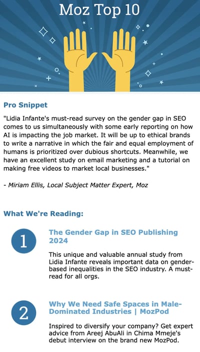
Image Source
Moz Top 10 is a semi-monthly roundup of top pieces of content about marketing. Essential to any marketer, Moz Top 10 links to key marketing content with actionable insights. The content is not just their own; they also link to external sources.
Moz Top 10 is perfect for busy marketers who would choose to discard the daily digests from their inboxes. Moz sends a newsletter every two weeks with ten new stories to share.
What I like: From a design point of view, the newsletter resembles Moz’s styling and brand image. To take things to the next level, Moz uses the first person to make the content more friendly. Finally, their end goal is not just to send visitors to Moz’s blog but to add value for the readers.
The newsletter provides digital marketing and SEO content examples, including how brands can take stands on issues and backlink index comparisons. These examples allow me to learn from the real world, something I love as a marketer.
Best for: Personal and insightful newsletters like this can be replicated by digital marketing agencies that don’t merely aim to push traffic to their website. Consider sending targeted news regularly with more time in between. This allows readers to find the value in your content without being overwhelmed.
9. Vox Today Explained
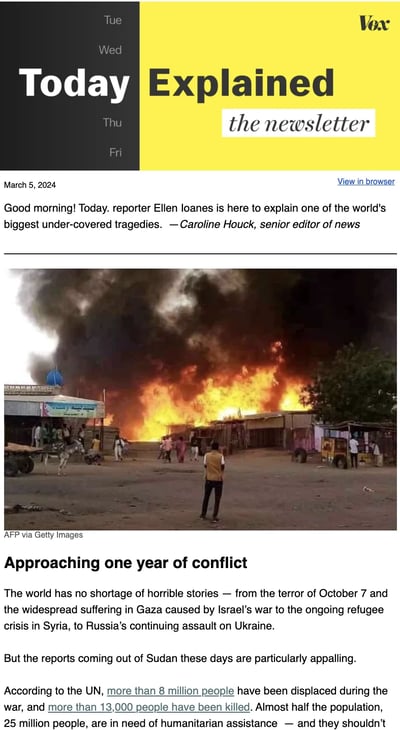
Image Source
Today Explained is a daily email meant to quickly get its readers up to speed with the most compelling stories from the day. The content ranges from the day’s top news to fun stories from all over the web.
What I like: I’m always amazed by this newsletter’s content curation. Instead of hopping on to different sources, I can collectively read news from a single source. They do a great job balancing their content with external sources, and the stories they choose are always really high quality.
The newsletter usually contains a detailed main story followed by other stories I can read outside of the email. To add authenticity, a senior editor typically writes the newsletter stories.
Finally, the white background blends well with yellow CTAs to add a captivating flare.
Best for: This text-rich email newsletter style is perfect for businesses with multiple categories and insightful stories to share with readers.
10. TheSkimm
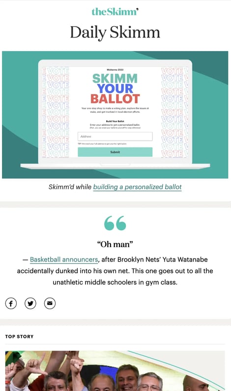
Image Source
If you want to stay up on what’s happening in the world and have some delightful writing delivered to your inbox first thing in the morning, look no further than TheSkimm.
It’s a daily roundup of what’s happened in the news in short, punchy paragraphs.
The best part? You don’t have to click out of the email to read the news if you don’t want to — although they do link to their sources if you want to read further.
What I like: As evident from their logo, TheSkimm puts more focus on women than men. That’s why this newsletter has more women subscribers between the ages of 22 and 34 than any other group. This newsletter shows me the power of knowing my audience and inspires my writing.
What follows next is the curated content that’s skimmable and divided into nice bits and pieces. Finally, the newsletter uses fewer links and no screaming CTAs to direct their readers to the blog.
For your own email marketing, TheSkimm is the place to go if you’re looking for writing inspiration or for emails without much visual content.
Best for: Businesses can learn the art of being engaging without any visuals or hard selling from this email newsletter. Businesses with a narrow niche but a large pool of content can leverage the styling and tonality of this email newsletter type.
11. Below the Fold
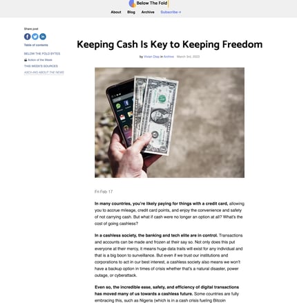
Image Source
Below the Fold is a weekly newsletter from Acciyo that surfaces essential and interesting stories that simply aren’t making headlines due to the crowded, never-ending news cycle we all experience daily.
Acciyo’s editorial team handpicks great news stories that they believe deserve “front-page love” but are being beaten out by an “infinite scroll of breaking headlines” — stories that range from how investors are profiting from emergency room bills to how one Mexican company turned prickly pear into sustainable fuel.
What I like: The editors at Below the Fold “unfold” the news stories in the form of conversational storytelling. The newsletter establishes a relationship with readers using a friendly tone.
The long, crispy headlines set the initial stage for me to dive in further. Their editorial team collects information from various reputable sources to build the final content.
They understand the importance of using bold words and sentences. I can easily see what matters most based on text alone.
Best for: The copy of Below the Fold offers a great example of how to share substantial content compellingly through storytelling. If you want to draw your readers in through stories, take a deeper look at this newsletter.
12. The Ringer
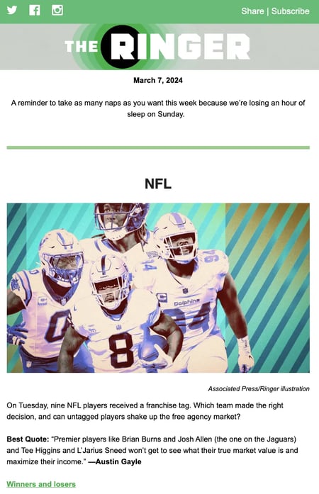
Image Source
Remember Grantland, the sports and pop culture blog owned by ESPN, which sports journalist Bill Simmons started? In October 2015, ESPN announced it would be ending the publication of Grantland.
Shortly thereafter, Simmons formed Bill Simmon Media Group and recruited a bunch of former Grantland staffers to launch a brand new newsletter called The Ringer in March 2016.
Although The Ringer was written and run by many former Grantland employees, it is a different project from Grantland’s.
Where Grantland focused on sports and pop culture, The Ringer branches out into other areas like tech and politics. Jon Favreau, a former speechwriter for President Barack Obama, is among the contributors.
I like their focus on experimentation: “We want to have fun, take chances, analyze, theorize, obsess, and try not to take ourselves too seriously,” said Editor-in-Chief Sean Fennessey.
Another differentiator? The Ringer’s website was developed in partnership with the publishing platform Medium — which means the newsletter reflects a clean, minimal design.
What I like: The Ringer is a unique newsletter for tech, sports, and pop culture. I love this newsletter’s diverse content, which includes discussion forums and top stories from sports professionals.
The short snippets of text with external links provide value to the readers.
This type of email is great for engaging the audience in a discussion thread. Further, the “share and subscribe” button provides more value to the audience.
The editorial team at The Ringer uses a formal and informative tone to engage with its sports-buff audience.
Best for: This type of newsletter works well for businesses with audiences interested in long discussion threads apart from spending some time on informative blogs and articles.
13. The Marginalian
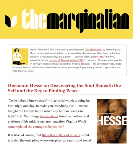
Image Source
The Marginalian (previously Brain Pickings) is one of the most interesting newsletters out there. In fact, its founder and writer, Maria Popova, calls it an “interestingness digest.” It records the week’s most interesting articles and pieces focused on art, literature, and philosophy.
Every Sunday morning, subscribers get the past week’s most unmissable articles about creativity, psychology, art, science, design, and philosophy — a wide variety of topics that appeal to a wide audience. At its core, it explores what it means to live a good life.
The Marginalian extends audiences’ marginal thinking with thought-provoking subjects. This long-text newsletter covers diverse topics with clear visuals.
What I like: For me, this newsletter’s conversational yet formal tone sets it apart. While using casual phrasing, the editorial team at The Marginalian uses advanced vocabulary (so you might need a dictionary by your side).
From the design point of view, the newsletter closely resembles the website. Both the website and newsletter provide similar experiences in terms of font, color, and spacing.
The white background perfectly complements the yellow CTAs and red heading texts.
Best for: If you want to offer a seamless reading experience with a clear CTA at the end, The Marginalian is an excellent example of how to do this. Lead your audiences to the end with a few hyperlinks, finally offering them the click.
14. The New Yorker Recommends
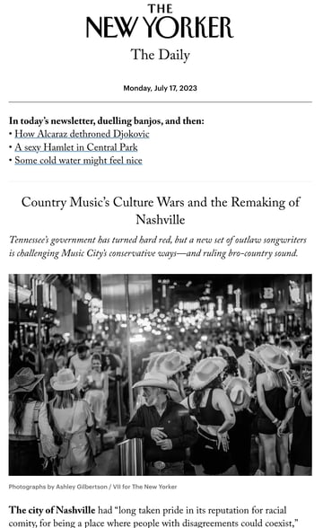
Image source
The New Yorker Recommends is a weekly newsletter highlighting what their staff reads, watches, and listens to. It is packed with curated recommendations for books, movies, TV shows, and music.
The core strength of this newsletter lies in its content. Every week, the editors at The New York Recommends pick a topic from its archives and craft it into a story.
Having staffers select their own recommendations gives this newsletter a personalized, hand-curated feel that helps readers connect with the content.
What we like: I’m a big New Yorker fan. That goes beyond their iconic tote bags and extends to their newsletter. I love the deep dive into an initial long-form story followed by a few recommendations at the second fold of the newsletter.
The New Yorker personalizes the tone and builds a relationship with its audience. Thereafter, editors share the most popular recommendations, such as events and the best books to read.
Just like National Geographic, The New Yorker Recommends has multiple newsletter options to choose from. Apart from the daily and weekly newsletters, they offer satirical or humor-rich email newsletters.
Best for: This type of newsletter example is perfect for businesses that have a large audience, even if it’s a broad niche. For instance, a blog focused on the reviews and recommendations for SaaS products can personalize the content and create multiple newsletters around different subjects.
15.Polygon Patch Notes
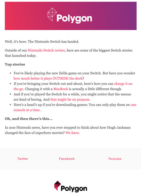
Polygon Patch Notes shares the staff’s picks for new movies, TV shows, video games, comics, manga, and tabletop RPGs. The newsletter also links to a free new game and highlights top stories on Polygon, ranging from reviews to guides.
The mix of curated staff picks and top stories in a simple format makes this an easy-to-digest newsletter.
Polygon Patch Notes also employs a personable tone, making the read relatable and fun rather than overly businesslike and bland.
What I like: There are a lot of things to love in this short newsletter. First, the starting sentence is concise yet engaging. Second, they share top stories in a second person, conversational tone. The hyperlinks in the newsletter are natural and align well with the content.
Further, the blend of the brand’s color palette with the light fonts makes it perfect to read for the eyes. Finally, I love the reviews and recommendations around a single show, game, or topic.
Best for: This design is great for newsletters focused on a niche topic, aiming to catch readers’ attention and direct them to your blog.
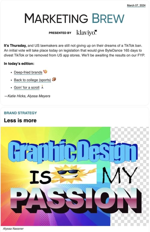
16. Marketing BrewNews+ Audio
Marketing Brew sends daily emails covering social media, marketing, tech, brand strategy, etc.
What I like: As a marketer, I love to start my morning with a cup of coffee and this newsletter. The newsletter is handy to marketers and content creators as it covers the latest news happening in the industry. Since the newsletter is sent out daily, readers are always up-to-date with the latest.
Although their stories are loaded, the Marketing Brew newsletter still makes room for stories they’re jealous of — adding extra value for readers.
The newsletter also contains a job board for marketing job opportunities.
Best for: Marketers, influencers, and content creators who want to keep up with happenings within their industry.
17. Cut The Fluff
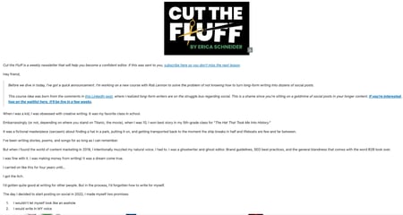
Image Source
Cut The Fluff is a weekly newsletter that centers around helping creators and writers go from confused to confident self-editors.
In this newsletter, Erica Schneider shares stories from her personal and professional life that break down editing one’s writing into actionable processes.
What I like: As the name suggests, each newsletter edition wastes no time getting to the point. Each concept is explained plainly, followed by specific steps readers can take to make their writing stand out.
The newsletter also contains extra resources, like Canva templates and Loom recordings, that help me do my best work.
Best for: If you want to build authority around a single topic and be the go-to person for said topic.
18.The Strategist
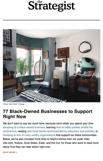
From New York Magazine, The Strategist curates deals, shopping advice, and discounts.
The newsletter does a great job of including relevant shopping information and paying attention to the trends. The Strategist also includes various products and services to shop for, casting a wide net.
What I like: The newsletter starts with different sections covering the best deals and discounts, followed by top stories worldwide. The Strategist is a perfect example of an effective email structure with a simplistic design. The writing style is personal (second person) and blended with relevant visuals.
Though the Strategist covers various discounts and deals, it doesn’t fluff the newsletter merely with the deals. Instead, they share stories about various social issues and topics related to what’s happening around the globe.
Best for: The newsletter works well for ecommerce sites, deals, and discount retailers that release weekly offers for their audiences. Plus, the insightful news and stories offer relevant, valuable content to subscribers.
19. The Curiosity Chronicle
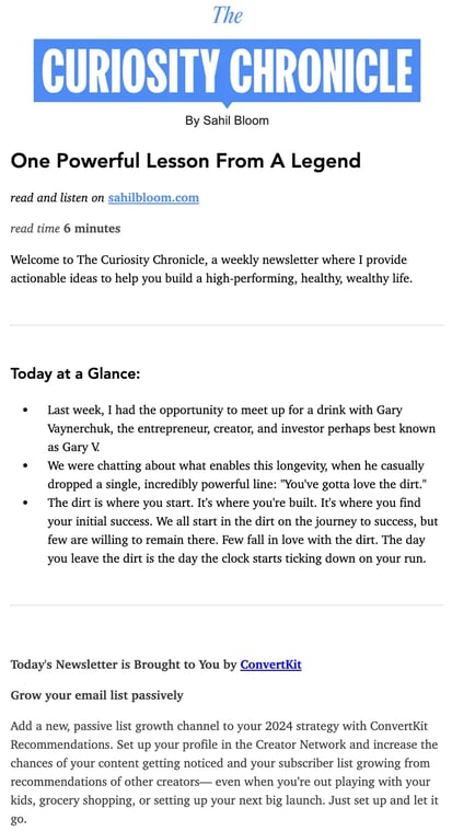
Over 700,000 people receive The Curiosity Chronicle in their inbox every week. The newsletter discusses frameworks, tools, and the mindset needed to build a wealth and healthy life.
What I like: The Curiosity Chronicle usually contains a summary at the start of the email. This top-level summary helps me know what to expect before I commit my time. It also helps that an estimated read time is included at the start of each letter.
If I don’t have the time to read, I can listen to the audio version of the newsletter on my commute or as I clean my house.
And if you want to catch up on previous newsletter editions, you can easily find them on the website linked in the email.
Best for: Marketers, businesses, and content creators who have much to say but don’t want to waste too much of their audience’s time. You can provide alternative means for readers to catch up or enjoy your newsletter on their tight schedules.
20. Workable
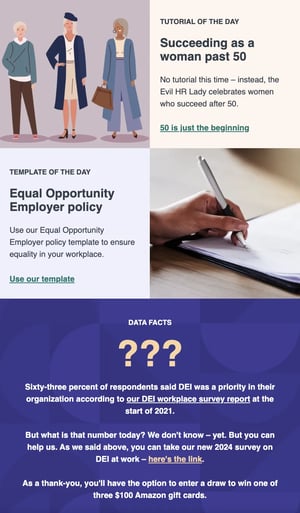
One of the best business newsletters is from Workable. One thing distinguishing Workable from other brands is that they use the same colors across social media, website, and email designs.
What I like: I love this newsletter’s personable tone.I get emails from a personal email address. Plus, they also get to see the sender of the newsletter with an image at the bottom.
The tone of the copy is actionable and direct. In the first fold of the email, they address a problem, while the second fold of the email provides a potential solution with some recent trends and numbers.
The most effective element of this newsletter is its logo and vibrant images that tune well with the headings. The text in the newsletter is more conversational and approachable.
Finally, the CTAs in trademark green with concise text send out a loud and clear message without being pushy.
Best for: This newsletter is a great inspiration for businesses that want to send more readers to their blogs naturally. If they have a problem–solution email in mind, Workable is their best bet to learn from.
21. Contentment
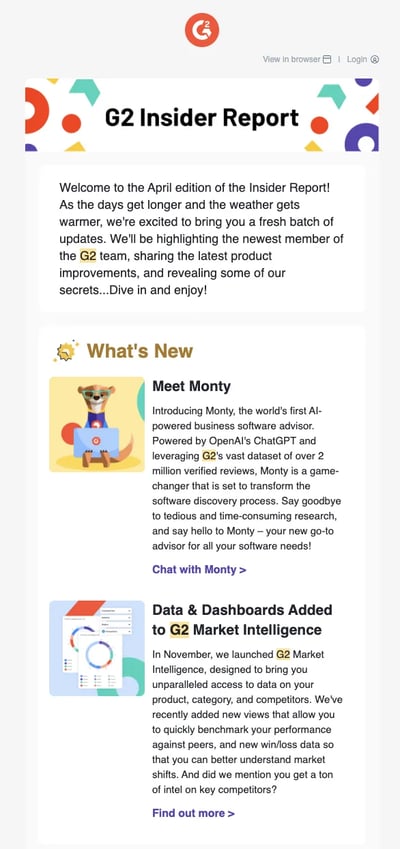
The last (but not least) on the list is WorkWeek’s Contentment newsletter, written by Tracey Wallace.
The newsletter focuses on content marketing wisdom and contains helpful tips and tricks to help content marketers across various industries improve their work.
What I like: The newsletter’s curated content contains research-backed recommendations from top marketers that help readers cultivate the necessary content marketing skills.
I also get to develop myself and my marketing career with their advice on building the soft skills needed to thrive in a fast-paced work environment.
Best for: Beginner to intermediate marketers who want to level up.
Creating an Email Newsletter Your Subscribers Love
Even though newsletters are one of the most common types of emails to send, they are actually some of the hardest to do right.
We hope these examples give you some quality inspiration so you can create newsletters your subscribers love to get in their inboxes.
![]()
