Updated on February 2, 2022 to include new advancements in Google Analytics since the original publication of this post in 2007 (!).
Ages ago, our founder Ian Lurie wrote this piece on navigation analysis in Google Analytics. Coincidentally, it was published in 2007. I would join Portent later that year, fall in love with digital marketing, and begin building the infrastructure that would become our analytics team.
Reading back through his original post, I was struck by a few things:
- How old the screenshots looked (800 x 400 pixels was considered a pretty high-resolution screenshot back then).
- How crude but effective the old Google Analytics UI was (simple line art icons and Arial font family as far as the eye could see).
- How little the substance of these reports has changed over the years (analyzing content on the web is still pretty simple).
So let’s dig into what’s changed and how to make the best use of navigation analysis in Universal Analytics.
Navigation Summary
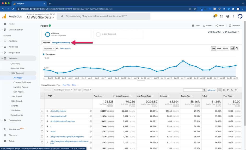
To get to the Navigation Summary report, go to the Site Content > All Pages report. Up at the top, near the Explorer tab, you’ll find Navigation Summary.
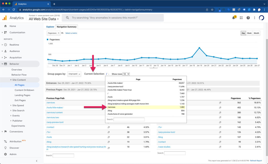
Once there, you can use the Current Selection dropdown to choose a page that’s the starting point for your analysis. For this example, we’ll look at Portent’s Services page.
When your page is selected, you’ll see two tables below it:
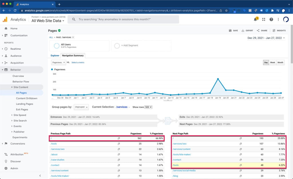
- Previous Page Path – the pages they saw immediately before your selected page
- Next Page Path – the pages they saw immediately after your selected page
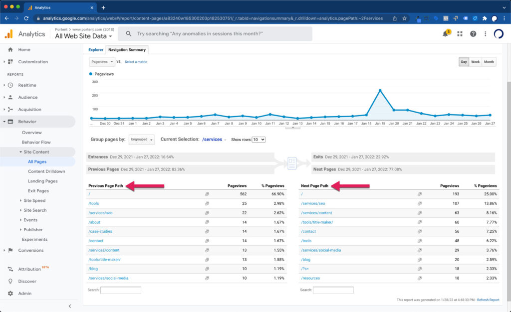
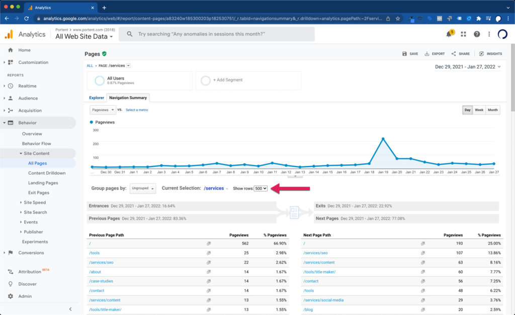
By default, it shows the Top 10 Previous and Next Page Paths, but if you have a massive website and need to see more, you can show up to 500 rows.
What are you looking for in the data?
A good rule of thumb is the 5% rule. If a user navigates to or from your selected page more than 5% of the time, that’s a meaningful click-through rate. Particularly, if your selected page has a sample size of over 1,000 pageviews in the time span you’re looking at.
This analysis can also help you identify navigation loops or “u-turns” in your user behavior. In this case, the top previous page and next page paths are both the Homepage of our site. We can use this knowledge to try and entice visitors to our Services page to click on other content sooner, offering them an above-the-fold call-to-action.
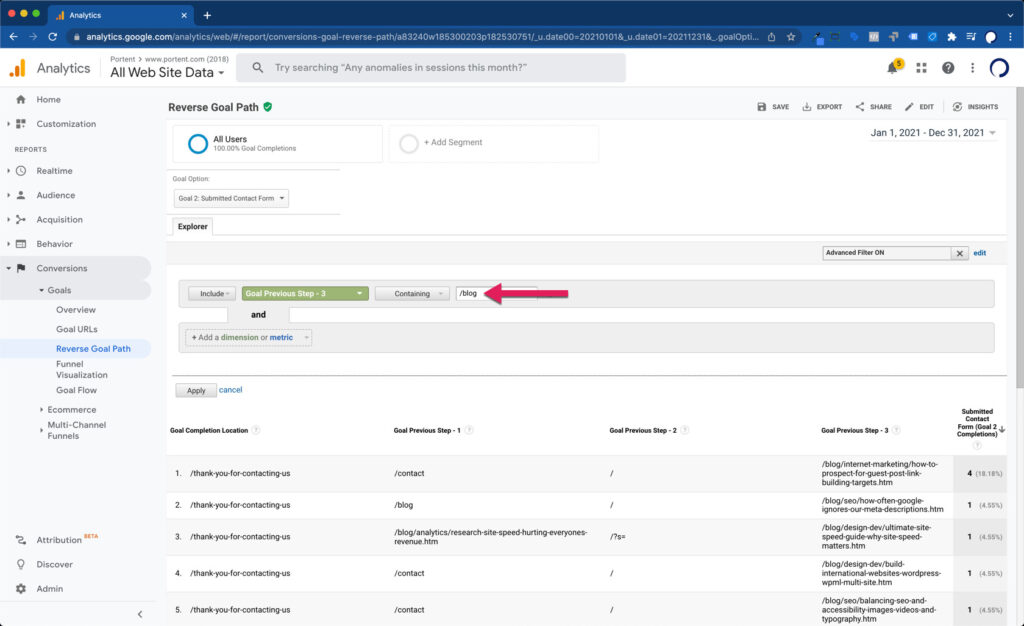
Reverse Goal Path
The next most valuable navigation analysis you can do after you’ve understood the basic navigation summary is to look at the Reverse Goal Path report.
It’s easy enough to find, under Conversions > Goals > Reverse Goal Path.
Once you’re there, it’s important to try to solve a specific question. In this case, I want to know how many people read a blog post before filling out our Contact Us form and what pathways they took to that goal. That’s easy enough to do by:
- Choosing the goal I want to reverse engineer from the dropdown (in this case, the Submitted Contact Form goal), and
- Filtering for Goal Previous Steps that included any page in the /blog section of our site
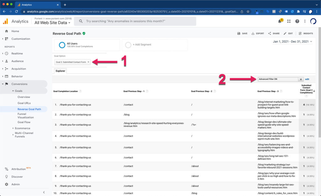
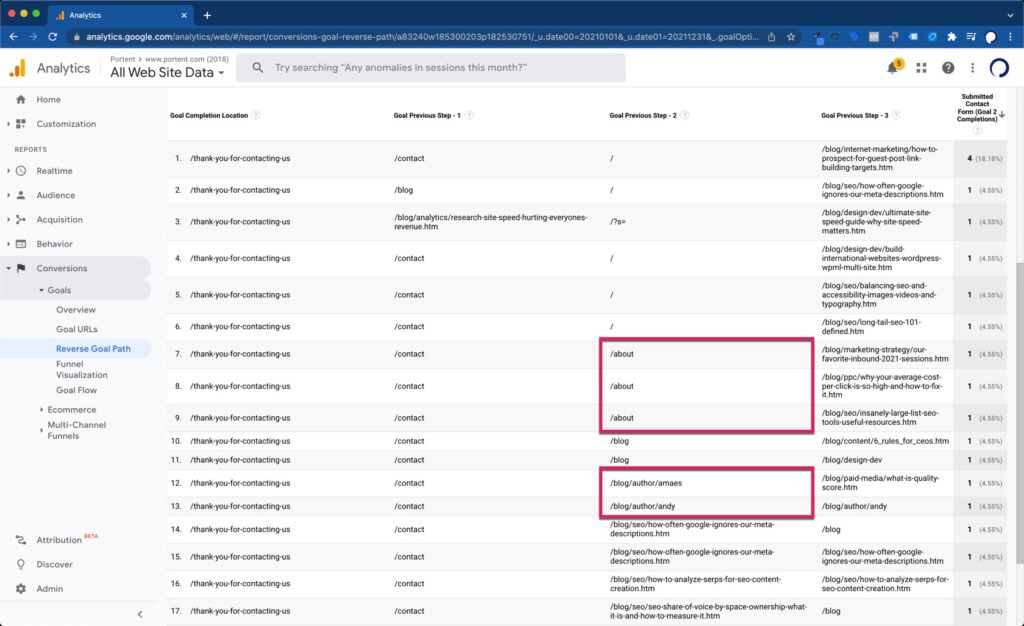
What does this tell me about our blog?
That our SEO team does an amazing job writing posts that get people to want to learn more about our services! In some circumstances, they read two SEO blog posts in a row before making their way to contact us.
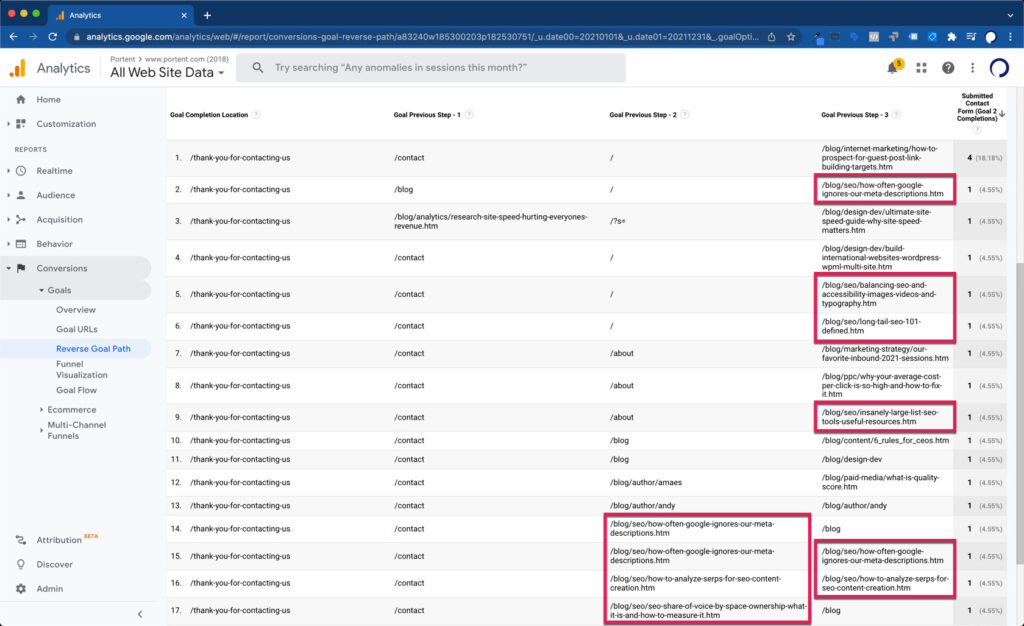
It also shows that our About Us and Blog Author pages are important stopping points in a person’s decision to contact us. They want to know that we’re not just a content farm and that there are real experts on the other side of the contact form waiting to speak with them.
Users Flow
All the methods of analysis up until now haven’t touched at all on how people got to the site to begin with. Oftentimes, that can dictate how they behave on the site. That’s where the Users Flow report comes in.
To get to the report, go to Audience > Users Flow, and then set the initial dropdown you see to either “Default Channel Grouping” or “Source / Medium” depending on how you want to see the incoming traffic channel or source.
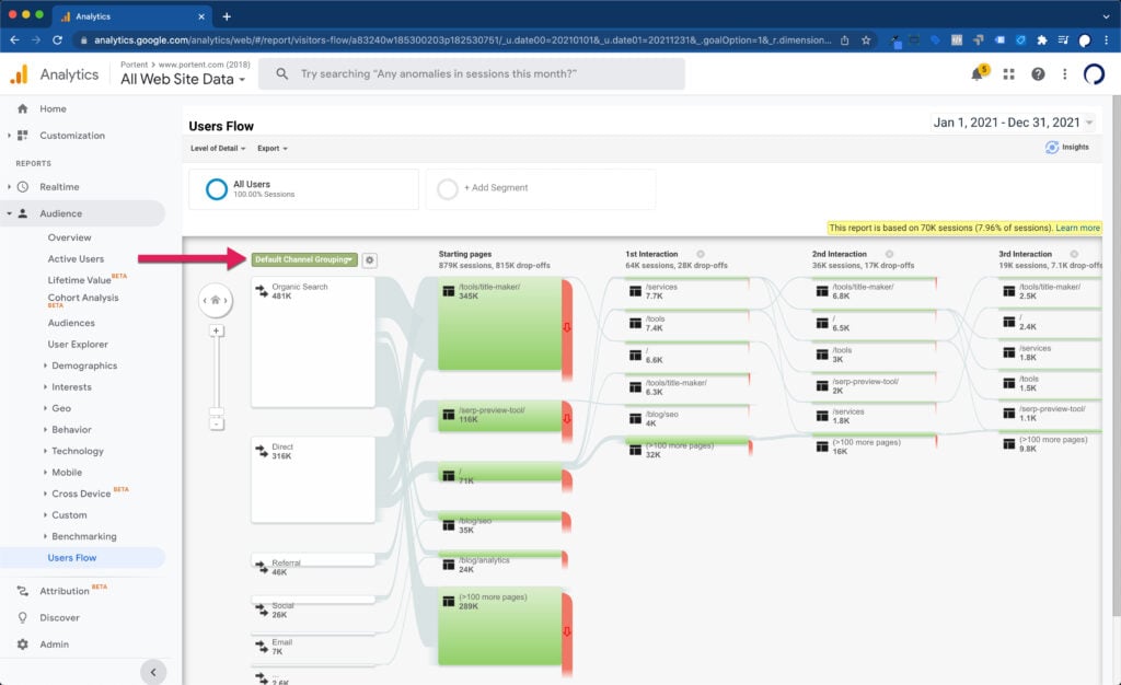
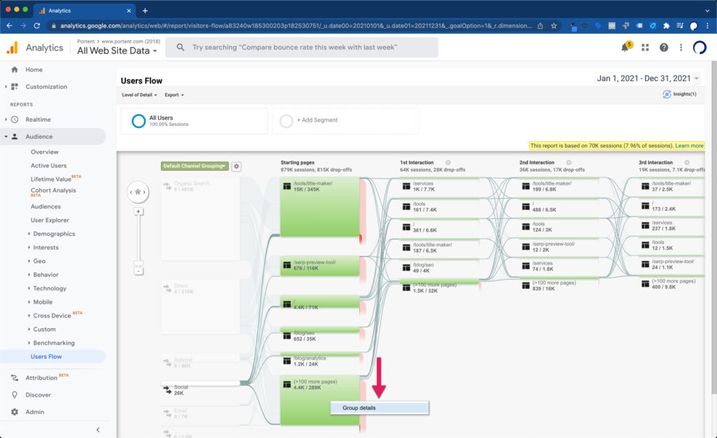
This will allow us to isolate, for instance, Social Media visitors and see what their top starting pages and most common paths are through the website. You can click on any of the Channels and select “Highlight traffic through here” to make the report easier to parse.
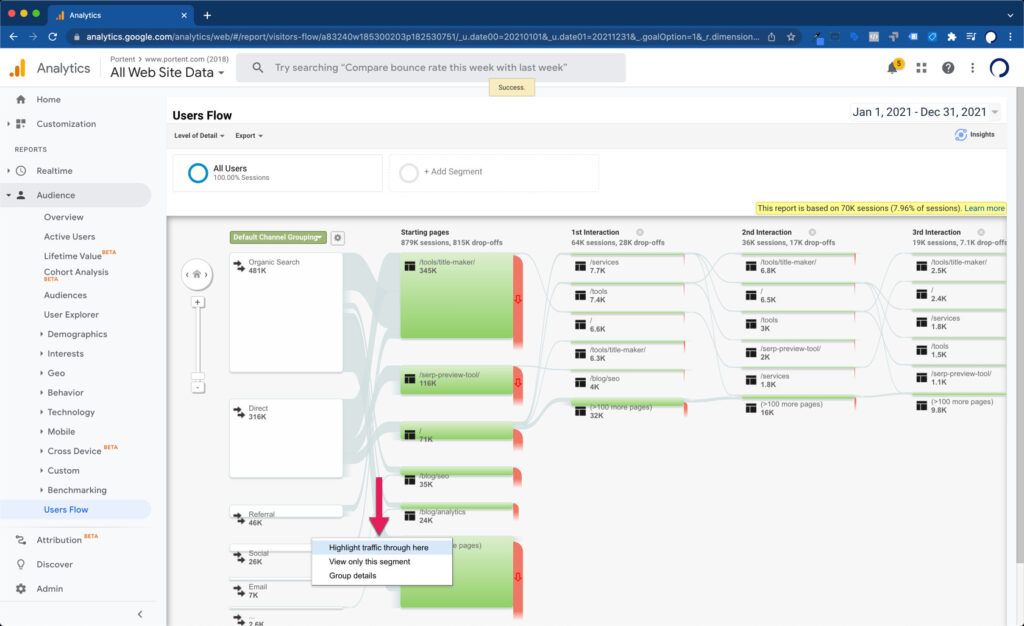
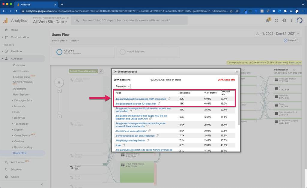
That’ll show you the top five starting pages through that channel and the next 100 pages after that. To expand the next 100, choose “Group details.”
Using our 5% rule again from the Navigation Summary report, we can analyze blog posts that are common starting pages in a user’s journey. Except this time, we have some context around how visitors came to the site originally and, perhaps more importantly, see the rate at which they dropoff!
Let Your Navigation Analysis Take Flight
Hopefully, these three simple methods give you something to chew on in terms of user journey data through your website.
As GA4 continues to push the envelope around innovating methods to look at pathing and funnel analysis, we’ll commit to sharing our favorite ways to use those too!
(I promise you we won’t wait 15 years between posts on that. Heh!)
The post Using Navigation Analysis in Google Analytics appeared first on Portent.