Think about the number of ads you see in an average day. Can you remember them all? Don’t worry if the answer’s no. After all, the average person sees up to 10,000 ads per day across the internet!
Let me ask you an easier question. Think about the last marketing campaign you can remember. The last ad that made you sit up and take notice. What about the ad caught your attention?
Chances are, you’ve got something visual in mind. Whether it’s an image, video, or interactive picture, I bet you remember something about the aesthetic—the graphic design.
See, graphic design is about communication: sending the right message to your intended audience and showcasing what’s special about your brand. Let me show you why graphic design matters in paid ad campaigns and the types of elements you can use to craft stand-out ads.
The Importance of Graphic Design in Paid Campaigns
Honestly, there are so many reasons why visual elements work in ad campaigns. However, we’ve narrowed it down to three main reasons graphic design is crucial to paid campaigns, whatever niche you’re in.
For starters, graphic design allows you to make a great first impression with your target audience. It sets the tone for how a prospect perceives your brand. Do first impressions really matter, though?
Sure. Just think about how much competition is out there, for one thing. Stand out from the crowd by setting a professional, positive first impression with eye-catching designs.
Secondly, graphic design helps reinforce your brand identity. It allows you to tell your brand story in a unique, creative way designed to grab a prospect’s attention. You can use a series of consistent, connected ads to really drive home your desired messaging and shape your audience’s perspective of what your company stands for.
Finally, great visuals speak louder than words. They transcend language and cross boundaries to communicate strong, effective messages to a target audience.
The key takeaway? Graphic design helps you craft content that attracts attention and sticks in a prospect’s mind long after the content disappears from their screen.
Graphic design sounds great, right? It is, but bear in mind some words of caution: While great visuals can do wonders for your brand, poor graphic design can leave a bad impression.
Stick with high-quality, professional graphic elements, and keep your messaging consistent: It takes five to seven interactions for someone to remember a brand, so make it easier by communicating consistently.
Not sure where to start with graphic design? You have two main options. If your budget stretches to it, you might want to hire a professional company to help you design great graphics. Alternatively, there are numerous graphic design tools you can use to create your designs in-house.
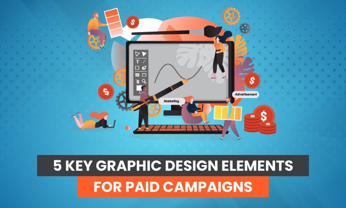
5 Key Graphic Design Elements in Paid Campaigns
OK, so that’s why graphic design is crucial to any successful paid campaign. What elements go into a great ad, though? How do you make different visual elements work together to create a memorable campaign?
Well, while there’s no “magic” formula, there are five key elements you can use to create visually engaging campaigns. You don’t need to use them all in every design, but you should ideally use as many elements as you can to enrich your content. After all, you only have roughly two seconds to grab a person’s attention before they move on, so your paid ads must stand out.
With that in mind, let’s take a look at each element in turn and consider what they are, how they’re used in graphic design, and how they work together.
1. Typography
In graphic design, typography refers to how you arrange text within your advertisement. It’s how you display words to quickly capture someone’s attention and communicate your core message.
Typography tells people why your ad matters, so it’s crucial you choose the right words. However, what’s equally important is the font and the text size.
The font directly impacts the vibe or mood of your ad. For example, a sharp, angular font sends a strong message:

Softer fonts, on the other hand, have a more relaxed vibe:

Size and density matter, too. Large, thick lettering conveys a powerful message, while smaller, thinner letters are more elegant and timeless.
Finally, typography covers text emphasis. Highlighting, bolding, or italicizing some words draws special attention to them, so people quickly know which words to pay the most heed to.
Don’t let typography daunt you. Think of it as how you put words together on the screen. Experiment with different text positioning to ensure the ad is well-balanced, and check out examples of ads in your niche to see what works and what doesn’t.
2. Visuals
By “visuals,” I’m talking about the actual images you use to grab someone’s attention. Visuals can include:
- illustrations
- photographs
- videos
- logos
- graphs
- pie charts
Why are visuals so important? Well, they make up the bulk of your ad. Unless you use particularly bold lettering or a lot of blank space (which we’ll cover later), images are central to your visual content.
You can use visuals to convey messages that may be hard to express through words, or you might use visuals to reinforce a written message.
Videos, for example, help you describe how something works in more detail. It’s an opportunity to get closer to your audience and build trust in your brand:
Infographics, on the other hand, help marketers condense complex points into visually appealing content that’s easily consumed and understood. Finally, elements like logos allow marketers to increase brand visibility on social media and elsewhere online.
The takeaway? You can use visuals to craft a consistent brand presence while communicating your core message in an engaging way.
Visuals are key to shaping the overall mood of your graphic design, so think carefully about the type of visual elements you want to include to maximize your ad’s chance of success. Again, it might be worth scoping out successful ads in your niche and seeing what you can learn from them.
3. Space
Specifically, space in graphic design refers to the space surrounding other elements like text, shapes, or visuals. It’s also referred to as “white” space or “negative” space.
Think of white space as your foundation. You start with a blank or white screen, and you build the other elements around this space. In other words, white space is the canvas, allowing you to balance contrasting elements, draw attention to key visuals, and create the right vibe.
To be clear, there’s no need for the space to actually be white; it can be any color. What matters is that there’s clear space between your visual elements to avoid a confusing aesthetic.
The main point to bear in mind? If there’s not enough space between elements, your design might be cluttered, jarring, and difficult for your audience to make sense of. On the other hand, if there’s too much space, the ad might seem redundant or hollow.
Learning the art of white space is key to mastering how to craft well-balanced, appealing content for landing pages and campaigns.
4. Color
I can’t overstate how important color is when choosing graphic designs for your paid campaigns. Whether you opt for a bright, vibrant palette or muted, dulcet tones, the color choice affects the whole mood of your campaign.
In design, we can group color schemes into categories based on where they sit on the color wheel. Here’s a simple example of a color wheel:

Complementary colors sit opposite each other, such as yellow and purple. Monochromatic colors, on the other hand, are simply different shades of one color (such as different hues of blue.)
Analogous colors sit beside each other, such as orange and yellow, while triadic colors are evenly spaced across the wheel (such as yellow, red, and blue.)
Graphic design involves selecting a color palette to dictate the mood or communicate an emotional response. Bold colors and warm hues, for example, invoke different vibes from cold colors or softer, pastel shades.
You can play around with different color combinations until you find the one which feels right.
Don’t forget to consider what colors to use for all visual elements and how they might work together. If you opt for black and white text, think about how this might work with the color scheme for your background and chosen visuals. A disorganized, fragmented color scheme can ruin the look of your design.
5. Lines and Shapes
In graphic design, lines are about more than just connecting dots. Lines have numerous artistic purposes, such as:
- organizing information in a compelling way
- creating a mood or invoking feelings
- building a sense of movement or momentum
Lines are highly expressive tools. They can be:
- curved
- straight
- solid
- dotted
- thick
- thin

The type of lines you draw depends on the message you’re trying to send to your audience.
Shapes in graphic design simply mean forms contained within lines, such as rectangles, squares, circles, and so on.
There are two main types of shapes: organic and geometric. Organic shapes are less well-defined. They include natural shapes, such as leaves, and irregular or curved shapes, such as vases. No two organic shapes are the same. By contrast, geometric shapes are more simplistic. They can be 2D or 3D, depending on the form, and they include shapes like triangles, rectangles, and spheres.
In graphic design, you can use a blend of organic and geometric shapes, or you can stick with one category for a more uniform design.
Frequently Asked Questions About Graphic Design in Paid Campaigns
What is graphic design?
Graphic design is a means of creating visual content. Using a blend of color, imagery, and text, graphic design communicates specific messages in a visually appealing, engaging way.
Why is graphic design important in paid ad campaigns?
You can use graphic design to drive home your brand message more effectively through paid ad campaigns. With the right imagery, your ad can stand out from the crowd, which is especially important in a crowded niche. What’s more, professional graphics could make your brand seem more authentic and trustworthy.
How do I use graphic design in paid ad campaigns?
Graphic design works great on visual social media platforms such as Instagram, but you can also use it on display ads, landing pages, and Google shopping ads. Wherever there’s an opportunity to add imagery, the right graphic design elements can help you build a consistent brand identity online.
What graphic design elements should I include in a paid campaign?
Ideally, you’re aiming to include a blend of elements. The five key elements to choose from are text, color, space, shapes, and visuals. You don’t need to include every element in every ad, but you should use as many as you can to create eye-catching designs.
Graphic Design Conclusion
As a technique, graphic design itself is nothing new. However, if you get a little creative, you can use this tried-and-tested technique to craft unique, captivating content for your paid campaigns.
When you’re working on graphic designs, be sure to check out the range of image editing and graphic design tools available online. You should also evaluate successful ads in your niche to figure out what made them special and identify how you can use your findings to craft your content.
Finally, you might consider checking out my consulting services to see how I can help you take your paid campaigns to the next level.
How are you using graphic design in your paid campaigns?