Data is the backbone of marketing. It can show you where to focus your ad spend, what types of customers are most profitable, and so much more.
On its own, however, data is just numbers. To make the most of your data, you need to understand what it means.
That is where Google Data Studio comes in. Unlike Google Analytics, which gathers the data and offers (limited) display analytics features, Google’s Data Studio goes all out to help you understand what your data means.
Not sure how it works or if it’s worth the effort? This guide explains what Google Data Studio does and shows you how to make the most of it.
What Is Google Data Studio?
Google Data Studio is an online data visualization tool that helps users convert data into informative reports and interactive dashboards.
It is a powerful tool to help marketers and business owners use their data effectively by creating interesting reports like this one:

Google Data Studio is essentially a streamlined version of data visualization tools like Tableau and Clickview. While you won’t have access to quite as many features or coding capabilities, the platform is free and pretty easy to use.
Unlike platforms like Google Analytics or HubSpot, Data Studio is not a data source. It doesn’t collect the data; rather, it combines data from different sources, analyzes it, and then lets you create interactive reports, charts, and dashboards.
Why should you consider adding Google Data Studio to your marketing arsenal? Here are a few benefits:
- It’s free. (It is hard to beat that.)
- It combines data from several sources, providing a more accurate overview of your data.
- You can easily design charts, reports, and dashboards to help others understand what your data means.
- Dashboards allow you to sort and explore different data sets. For example, what is happening in a specific geographical region or during a particular month?
If you’re hitting a wall with your data and need a way to better understand how sales, marketing, or online traffic impacts your business, Google Data Studio is a tool you should use.
How to Use Google Data Studio to Improve Your Data
The first step to using Google Data Studio is to log in, which you can do here. You will need a Google account to access the platform. Below, we’ll walk through how to create a report, add data, and generate your first report.
1. Choose a Google Data Studio Report Template
There are two ways to create a report: create a blank report or use one of the templates. I recommend starting with a template, which you can customize to fit your needs. Once you have a better grasp of the platform, you can try your hand at a blank report.
Click Template Gallery to see more. Dozens of templates are available to choose from:

You can create and submit your own templates, but let’s choose an easy one to work with for now. Click Search Console Report, then Use Template.
Add your basic information, including country and company, and set your email preferences. I suggest opting into tips and recommendations to get a better grasp of the platform.
2. Add Data Sources to Google Data Studio
Now that you have a template, it’s time to create your customized search console report. Click Copy Report to use the template.
From here, you can change the name, share the report, add charts, and more.
The first step is to add your data to the report by clicking Add Data.

Choose where you want your data to come from. If you are still just getting a feel for the platform, I suggest using Google Analytics as your data source. It’s likely familiar to you and is pretty easy to set up.
However, you can also add data from many other sources, including (but not limited to):
- Google Sheets
- BigQuery
- Campaign Manager 360
- Google Ads
- Google Survey
- PostgreSQL
- YouTube Analytics
- AdRoll
- Facebook Ads
- Ahrefs
- CallRail
- Campaign Monitor
Select the account, property, and website data you want to add, then click Add.
3. Customize the Report Visualization
Now that you have data, it’s time to make this template your own. Nearly everything can be adjusted, which can be overwhelming, so let’s start with something small, like the date range.
Click the carrot next to the date in the upper-right corner of the report:

Then select the date range you want to view the data for:

Click Apply, and the report will update the charts and graphs to display the data.
This step is just sorting the current data. You can sort by date, country, landing page, and much more.
What if you want to add a new chart? Click Add a Chart in the navigation bar.

Next, select the type of chart you want to add. I’ll choose a bar graph, but you can also select a table, scorecard, time series, Google Maps, line bars, scatter plots, pivot tables, etc.
Your cursor will become a “plus” sign to add the chart. Select where you want the chart to go in your report and click. (Don’t worry, you can move it later.)
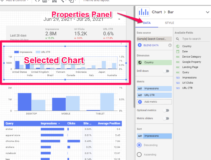
Next, click Dimension in the right sidebar (called the Properties panel.) This tells Data Studio what you want the graph to be about.

You can add additional dimensions, for example, landing page and country.
You can also sort the data in ascending or descending order, customize the default date range, add metrics sliders, and allow drill-downs.
To customize the look of your chart, click the Style tab in the Properties panel.
Here you can change the color, add bars, switch the graph orientation, and add a reference line.
Feel free to add different charts, adjust the style, and create the exact report you need to show off your data.
4. Share Your Google Data Studio Report
Once you have created your report, it’s time to share it with your team, boss, or clients. Here’s how to do it.
Click Share in the top right corner of your report.

See all the options? You can invite people to view the report, schedule an email delivery (very useful for client work), embed the report, get a link, or just download the report.
Even better, when you invite people, you can adjust their access to the report, which means you maintain full control over who sees it.
For example, you can give view-only access, allow editing, disable downloading, and more.

6 Tips for Using Google Data Studio Effectively
Data Studio is an incredibly powerful data analytics tool. We’ve covered how to create your first report and add the data, but that is just the beginning. Here are six more tips to get the most out of Data Studio.
Create a Custom Template
The templates Google provides are a good place to start, but you can also create a customized template. Say you sent out a monthly report on organic traffic. You could create the report from scratch every month—or you could save a custom template and simply add the new data each month.
Here’s how:
- After you create a report, click File > Make a Copy.
- Change the data source to one of the “Sample” data sources if you plan to share outside of your organization. (This uses sample data so your template doesn’t include sensitive data.)
- Select Copy Report.
- Change the name of the report to differentiate it. I suggest adding “Template” to the name.
- Use Share to manage access.
This video walks you through the process step-by-step.
Next time you need to create that report, save time and use your template.
Schedule a Report to Send
If you’re already using marketing automation to improve your workflow, you will love this feature. Google Data Studio makes it easy to schedule reports to send on a specific day, allowing you to automate report creation and delivery.
Here’s how.
After creating your report or dashboard, click the carrot next to the “Share” button. The drop-down menu allows you to schedule the report to be sent at any time in the future.

Modify the Date Range
If you’ve used Google Analytics, modifying the date range of Google Data Studio is going to be a breeze. If your report has a date range panel, select it, then use the Properties panel to adjust the date range.

Alternatively, you can create a date filter by clicking Page > Current Page Settings > +Add Filter and then setting the date parameters.

Add Different Filters
Applying filters in Google Data Studio allows multiple people to access the data they need at the click of a button. For example, if you have a traffic report for the last month, your marketing director might want to see how many people read the blog, while your sales director might want to see how many people hit your landing page.
Here’s how to filter your data in Google Data Studio:
- Make sure you are in Edit mode. (The button next to the Share button will say View when in Edit mode.)
- Click on the chart or graph you want to filter. The Properties panel will appear in the right sidebar.
- In the Properties panel, scroll down to Filter and click +Add a Filter.
- Select Include or Exclude, based on what you want the filter to do.
- Add a metric to filter.
- Add comparison operators such as equals, contains, greater than, less than, etc.
- Add a comparison value for your filter expression.
For example, if you wanted to exclude data from Italy, select Exclude > Country > Contains > Italy.
If you want to get more advanced with the filters, check out this advanced guide on Supermetrics.
Use Interactive Elements
Chart interaction filters allow users to click on chart elements to filter data rather than using the filter feature. For example, if you have a chart with data from different countries, clicking on Italy in the chart displays all the data from Italy.
To turn this feature on, make sure you are in Edit mode, then select the chart to add chart interactions. In the Properties panel to the right, scroll down to Interactions and select Apply Filter.
Experiment With Different Visuals
Creating visual representations of data allows your team to better understand—and use—your data. In addition to bar graphs and charts, you can add pie charts, bubble maps, scatter plots, checkboxes, and more.
To add these elements, click Insert, then select a visual from the list.

Use your cursor to add the table to your report, then access the Properties panel on the right to add the data source, dimensions, rows, and fields.
Frequently Asked Questions About Google Data Studio
Is Google Data Studio free to use?
Yes, as of publication, Google’s Data Studio is free to all users.
Who should use Google Data Studio?
Anyone who wants to make better use of their data. Marketers, sales teams, and business owners can use Data Studio to turn hard-to-understand data into engaging, interactive reports.
What does Google Data Studio do?
Google Data Studio combines data from Google Analytics and other sources to create visual reports to help you and your team better understand how your data impacts your business. You can create interactive dashboards, pie graphs, charts, pivot tables, and more.
How is Google Data Studio different from reports in Google Analytics?
Unlike Google Analytics, Google Data Studio is not a data source. It does not gather data from your website or any other source. Instead, it collects data from other sources, blends it, and makes it easier to create charts, dashboards, and reports your team can use to predict trends, track marketing campaigns, or forecast sales.
Google Data Studio: Conclusion
Marketing plans should be based on data, not guesses. With Google Data Studio, you can create beautiful interactive reports so you can use your data to make better marketing decisions—and present it to your boss, clients, or even investors.
There is a bit of a learning curve with Google Data Studio, but it is worth spending a few hours getting familiar with this easy-to-use data visualization tool. Follow the steps above, and you’ll be sending out professional reports in no time.
Have you used Google Data Studio before? What is your favorite feature?