What’s in this article:
- In this series, we take a look at how various brands’ websites and digital efforts have evolved over the years
- Here, we depict Under Armour’s innovative approach to eCommerce
By today’s standards, you’d be hard-pressed to find an athlete that hasn’t heard of Under Armour.
Heck, even those who haven’t touched a piece of sporting equipment since high school can recognize the brand’s patented moisture-wicking clothing and apparel from a mile away.
It’s hard to believe that the company’s only been around since 1996.
While Under Armour has, unfortunately, seen a decline in sales in the past five or so years, the brand’s eCommerce presence has proven to be its saving grace.
In light of this, we thought it would be a good idea to take a look back at the evolution of Under Armour’s website from its humble beginnings in 1998 to the present day.
Without further ado, let’s dive in.
1998-2000: Under Armour Blasts onto the Athletic Apparel Scene
(Quick note: Many images and other on-site content have not been properly archived — but we can still get the gist of the site’s overall appearance way back when.)
From the start, Under Armour had a clear idea of what it hoped to accomplish through its website.
Above all else, the team needed to inform their target audience of the value of their revolutionary apparel.
This meant providing a clear explanation of:
- How the apparel is made
- How UA’s apparel differs from most other athletic wear of the time
- How wearing Under Armour’s apparel benefits the customer

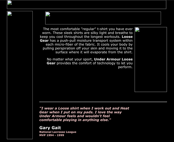


Being a newcomer to the athletic wear industry, the Under Armour team knew they’d need to leverage social proof from well-known athletes to build trust within their audience. As shown above, that’s exactly what they did — including in-depth quotes on each product category page on the site.
Finally, Under Armour paved a clear path to purchase for their online audience. Customers could order a product catalog to be delivered to their home — but could also purchase select items directly on the company’s website.
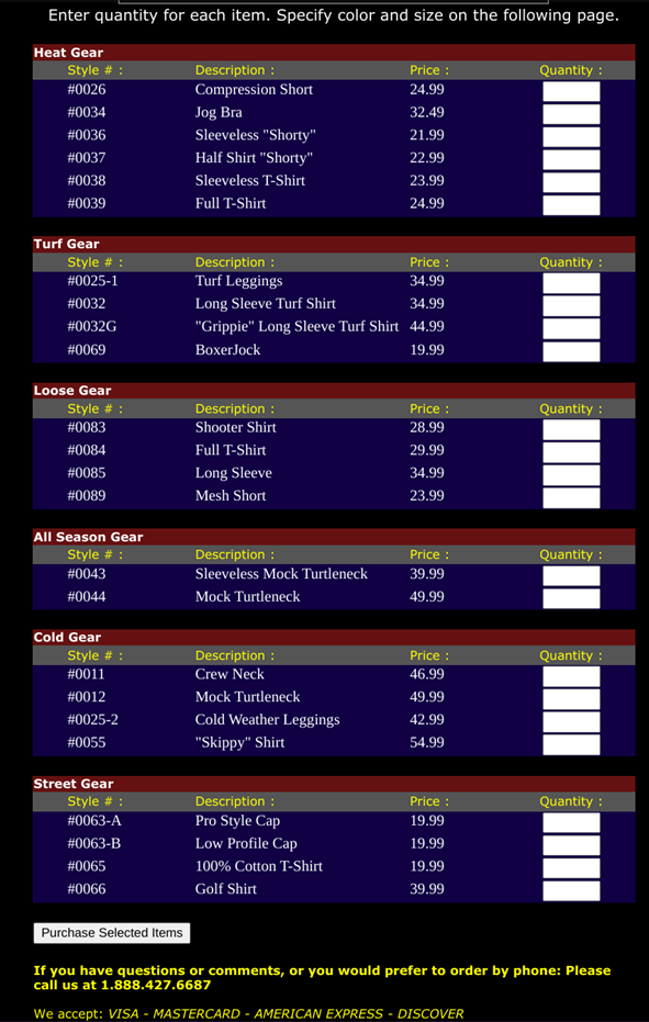
At a time when many established retailers had yet to allow for online orders, Under Armour’s innovative efforts made for a convenient and progressive digital experience for their target audience.
Overall, it’s clear that UA’s team understood the true value of its website from the very beginning. While many other companies were still gaining a basic understanding of how to use their website to engage and convert their audience, Under Armour had already begun making it happen.
2000-2001: A Flash-y Update
By late 2000, Under Armour had revamped its website quite a bit.
The biggest change:
Providing a more modern and user-friendly experience via Flash.
As you probably know, Flash is no longer supported by modern browsers — meaning we, unfortunately, can’t dig too much into this area of the site.
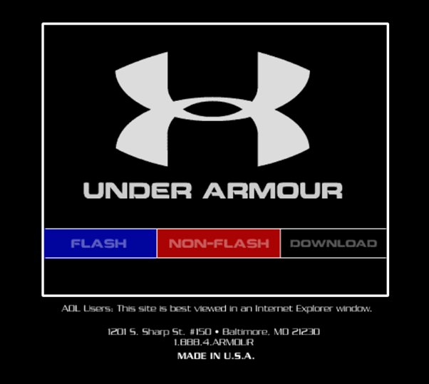
However, Under Armour also provided an HTML-based version of their website. Not only is this ideal for our purposes, but it also ensured that all visitors would be able to view their site’s content with ease.
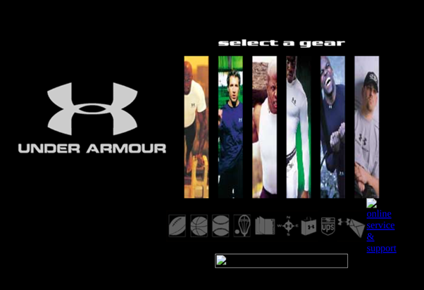
This updated version of the site was similar to the previous one — with a few key additions.
First, Under Armour added sport-specific product category pages to point individual customers toward more relevant products and content for their needs.
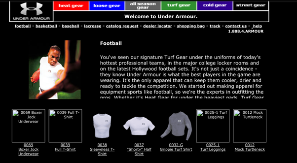
Under Armour also added individual product pages to their website, as well.
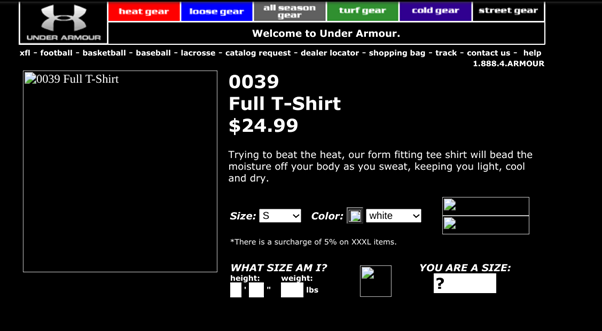
This allowed customers to get a bit more information on specific products and complete transactions in a way that’s a bit more in line with how it’s done today.
(That is, compared to the above process, in which purchases were made by submitting a rudimentary digital order form.)
With that being said, UA’s product pages at the time were a bit lacking in information, images, and other such content that could have further streamlined the customer’s path to purchase.
At any rate, this second iteration of Under Armour’s website shows a continued focus on using the site to provide specific and strategic value to the customer. Again, this intentional approach is leaps and bounds ahead of many other retailers, who at the time were merely dipping their toes into the world of eCommerce.
2005: Digital Content Takes Over
In spite of the death of Flash, we can still get a decent idea of what Under Armour’s site looked like back in 2005.
Just from this screenshot, we can see that Under Armour’s site underwent a bit of a structural overhaul — and that its product catalog had expanded to include women’s and children’s apparel, too.
Perhaps the most impactful difference between this and previous versions of the site revolves around content.
For starters, Under Armour began providing a bit more information on their product and product category pages:
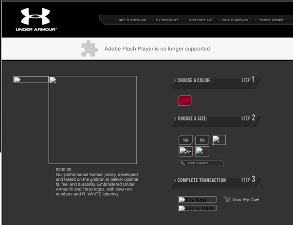
While still pretty “bare bones” compared to today’s standards, this content enabled customers to make more informed and laser-focused purchasing decisions based on their specific needs.
Under Armour also began heavily promoting news and information related to the brand and the company. From a more in-depth About Us page to press releases and breaking news, customers could now use UA’s site to dig beyond the actual products offered — and learn more about the team behind the apparel.
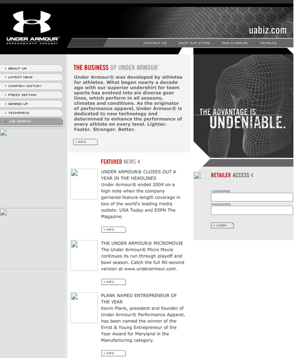
However, the biggest content-related improvement is the adoption of multimedia content marketing tactics to engage, inform, and even entertain site visitors.

From standard TV commercials to micromovies and series’, Under Armour’s content marketing efforts had, at this point, become in full effect — while planting seeds for further efforts in the future.
2012: A Major Site Upgrade
It doesn’t take more than a passing glance at its homepage to see how Under Armour’s website evolved from 2005 to 2012.
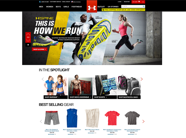
Overall, we’re now seeing a very heavy focus on product promotion throughout the site.
In addition to the tried-and-true methods of product categorization (i.e., by gender, apparel type, etc.), UA has now adopted a more dynamic approach to presenting its products.
Some key examples:
- Best-selling products
- Seasonal collections
- Trending apparel
Product and product category pages are also much more organized, informative, and immersive, as well.
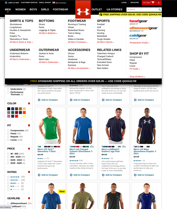
As you can see, it has become incredibly easy for customers to find the exact product they’re looking for. From the inclusion of additional categories (and subcategories) to ultra-focused filtering options, Under Armour has provided an intuitive browsing and shopping experience for its online customers.
Product pages have also undergone a makeover — and now include much more information to help customers with their purchasing decisions.
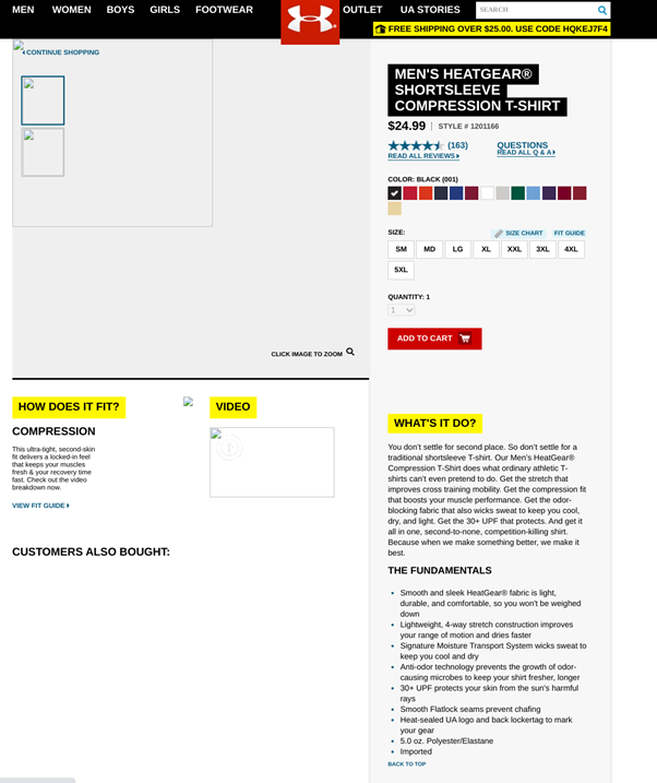
Some key additions to the product page include:
- Customer-facing copy (i.e., features tied to specific benefits)
- Product reviews and answers to frequently asked questions
- Multimedia content showcasing the product’s key features
Even though Under Armour’s products have taken center stage, UA still offers a variety of content and immersive experiences to site visitors.
UA’s interactive Fit Guides made it easy for customers to put together complete outfits.
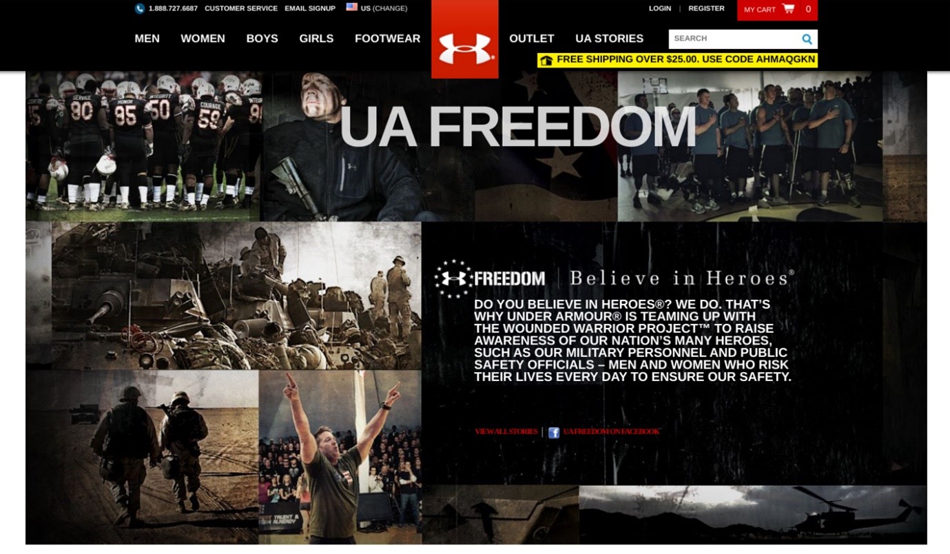
The team had also begun celebrating US veterans by offering them specialized products and deals and allowing them to tell their stories and make their voices heard.
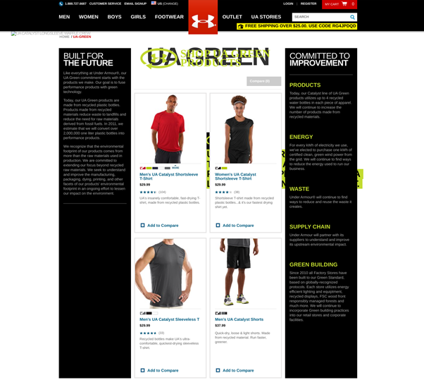
Similarly, UA had adopted a “green” initiative, promoting specialized products and becoming more dedicated to eco-friendly processes and operations.
Finally, UA’s Innovation Challenge enables customers to provide constructive feedback and suggestions on how the brand could improve in the future.
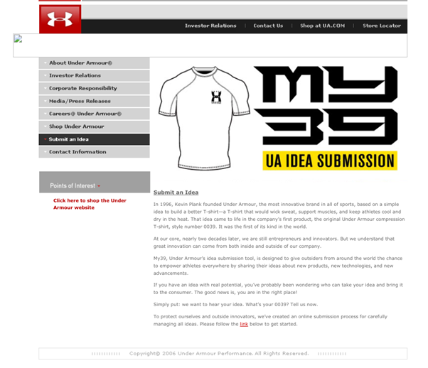
This adds another layer of interactivity to the site while also inviting UA’s audience to become a more integral part of the brand’s community.
At this point, Under Armour’s site isn’t just “a place to learn about its products”; it’s the core of the company’s digital and overall branded experience.
2017: A Refined Approach
By 2017, Under Armour’s site had taken on a more crisp, refined appearance.
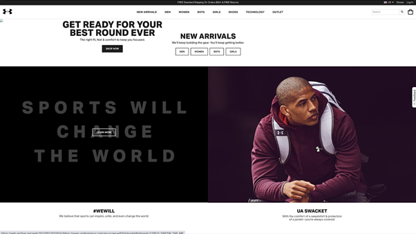
Here, product categories have continued to evolve — with a clear focus on allowing for purposeful browsing based on the customer’s individual needs.
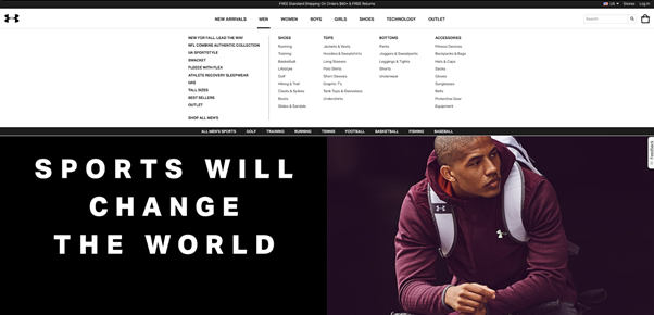
Under Armour had also taken its Fit Guide experience a bit further by introducing its Icon service. Here, customers could create fully customized sneakers using boilerplate templates, pre-created images, and user-created patterns.
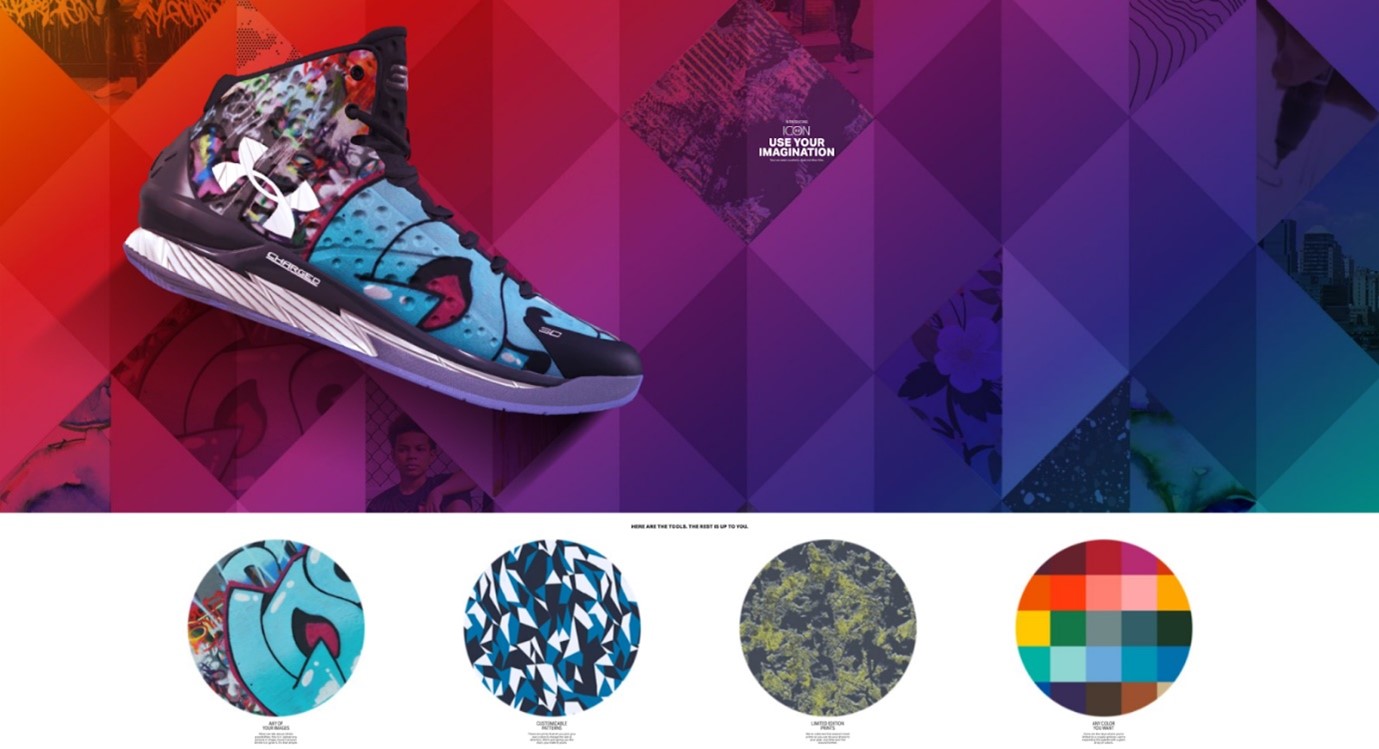
Under Armour’s approach to content marketing had evolved by now, as well.
In addition to using content to inform the customer’s purchasing decision, UA had begun using content to ensure customers get full and proper use out of their products, as well. This updated content library also included overarching tips to help customers improve their workout regimens, dietary habits, and all in-between.
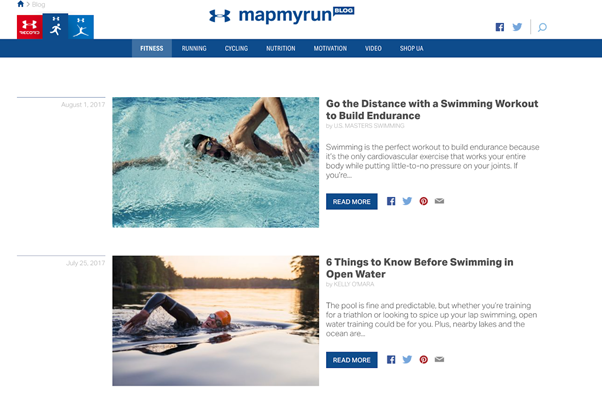
By 2017, Under Armour had clearly recognized the importance of community-building — as evidenced by its proprietary branded, internal social media network.
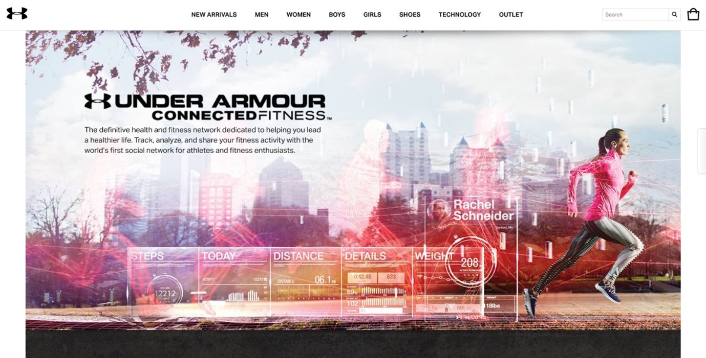
To add to this immersive social media experience, Under Armour introduced several smartphone apps — along with proprietary equipment to facilitate the use of said apps.
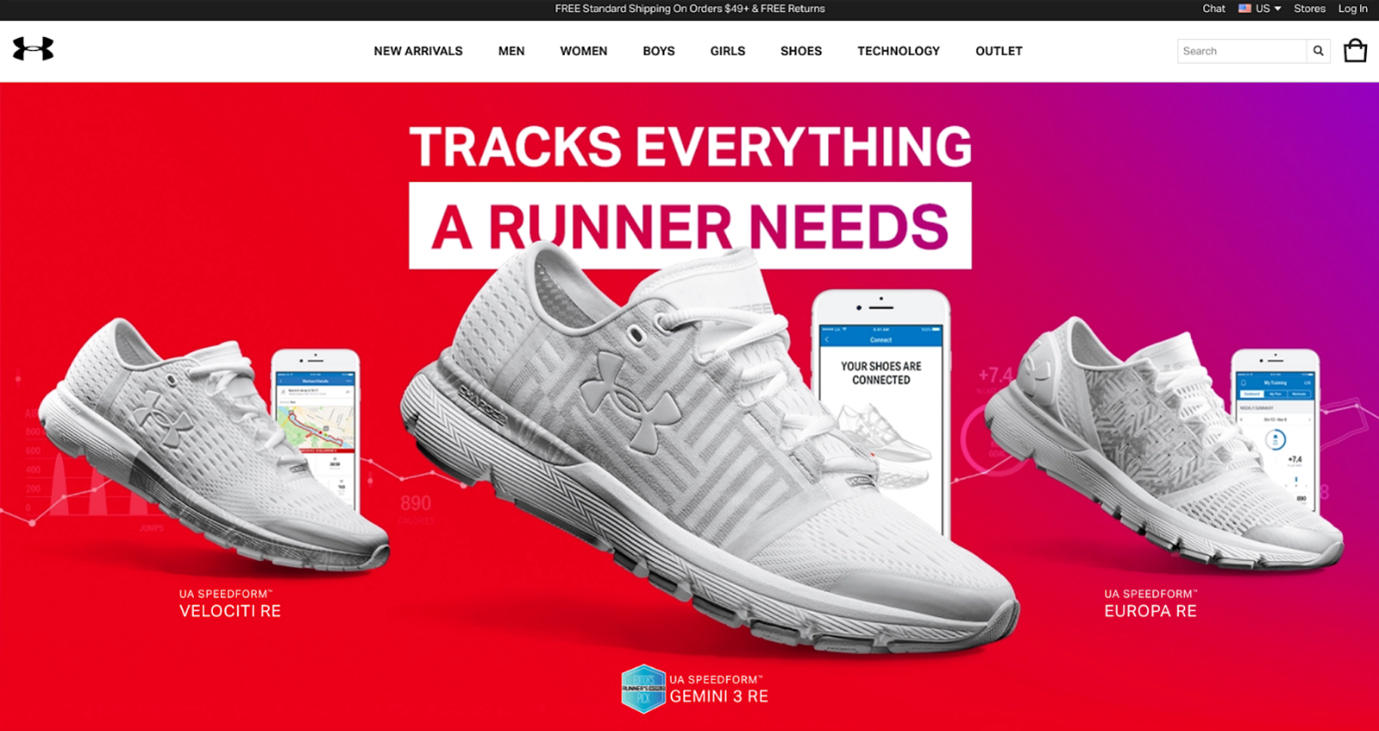
(Here’s where UA starts recognizing the importance of providing an omnichannel experience to its customers. More on that in the final section of this post.)
On that note, we were surprised to find that the 2017 version of Under Armour’s website doesn’t do all that much to promote its third-party social media channels (e.g., Facebook, Instagram, etc.). Though these channels had certainly existed at this time, there seems to be a pretty big gap between them and Under Armour’s central digital hub.
Despite this, Under Armour’s digital efforts made for a cohesive and connected branded experience for its customers.
And it’s only gotten better since then.
Present Day: Going All-In on Omnichannel
The modern version of Under Armour’s website takes the best parts of everything we’ve seen thus far — and takes it all to the max.
On the homepage, visitors are presented with a ton of branded content and product promotions:
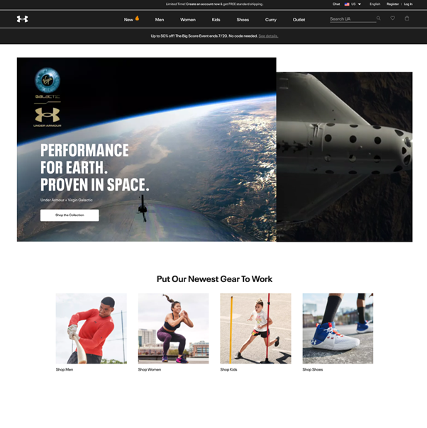
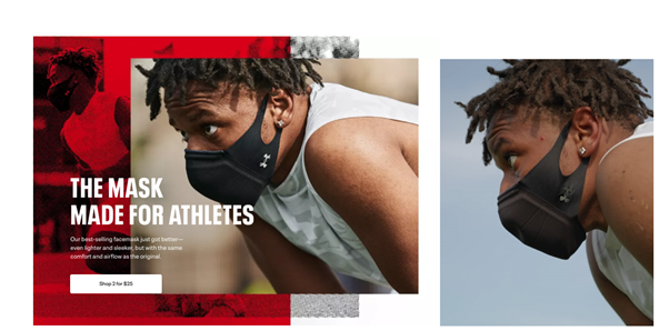
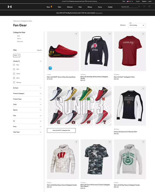
Surprisingly, UA’s product category pages have lost the microsite “feel”, and now simply offer lists of products (along with appropriate filtering options).
The one exception, here, involves Under Armour’s Curry brand.
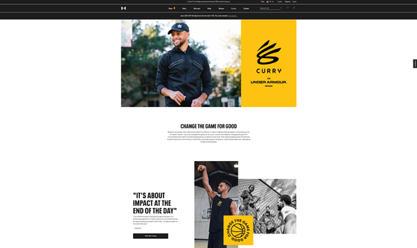
As you can see, this co-sponsored initiative (featuring NBA MVP Steph Curry) does offer a more immersive, microsite-like experience. Customers can not only check out Curry-branded products but can also dig deeper into the community-focused efforts Curry and the Under Armour team are putting together.
The most considerable improvement, though, has to do with Under Armour’s omnichannel initiatives.
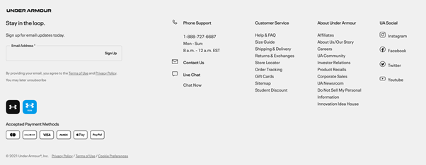
For starters, UA now includes links to its various social media channels within the footer of its homepage (and all other pages):
More importantly, UA now displays content automatically curated from Instagram featuring its products directly on the homepage.
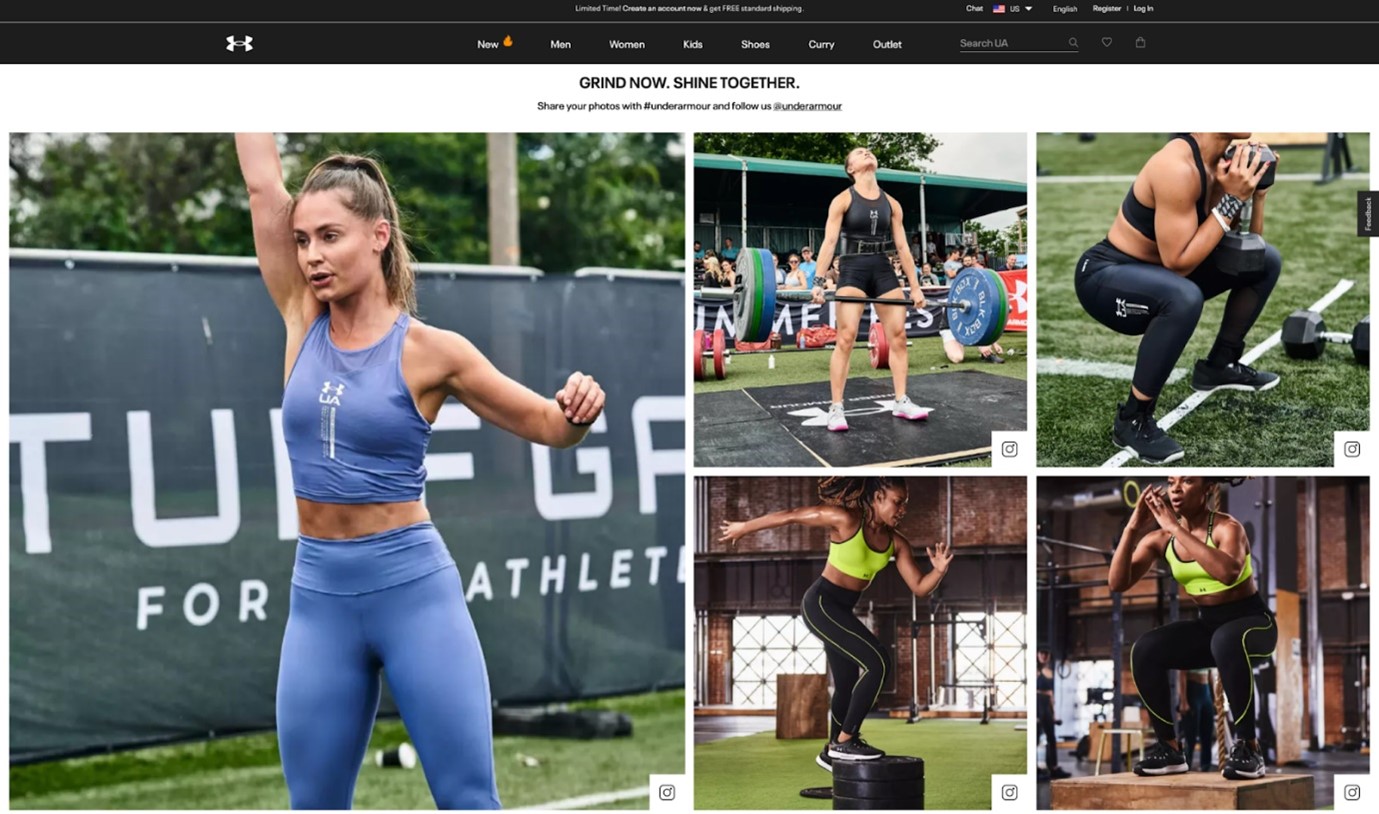
Visitors can then click on each individual photo for more information regarding the products being showcased.
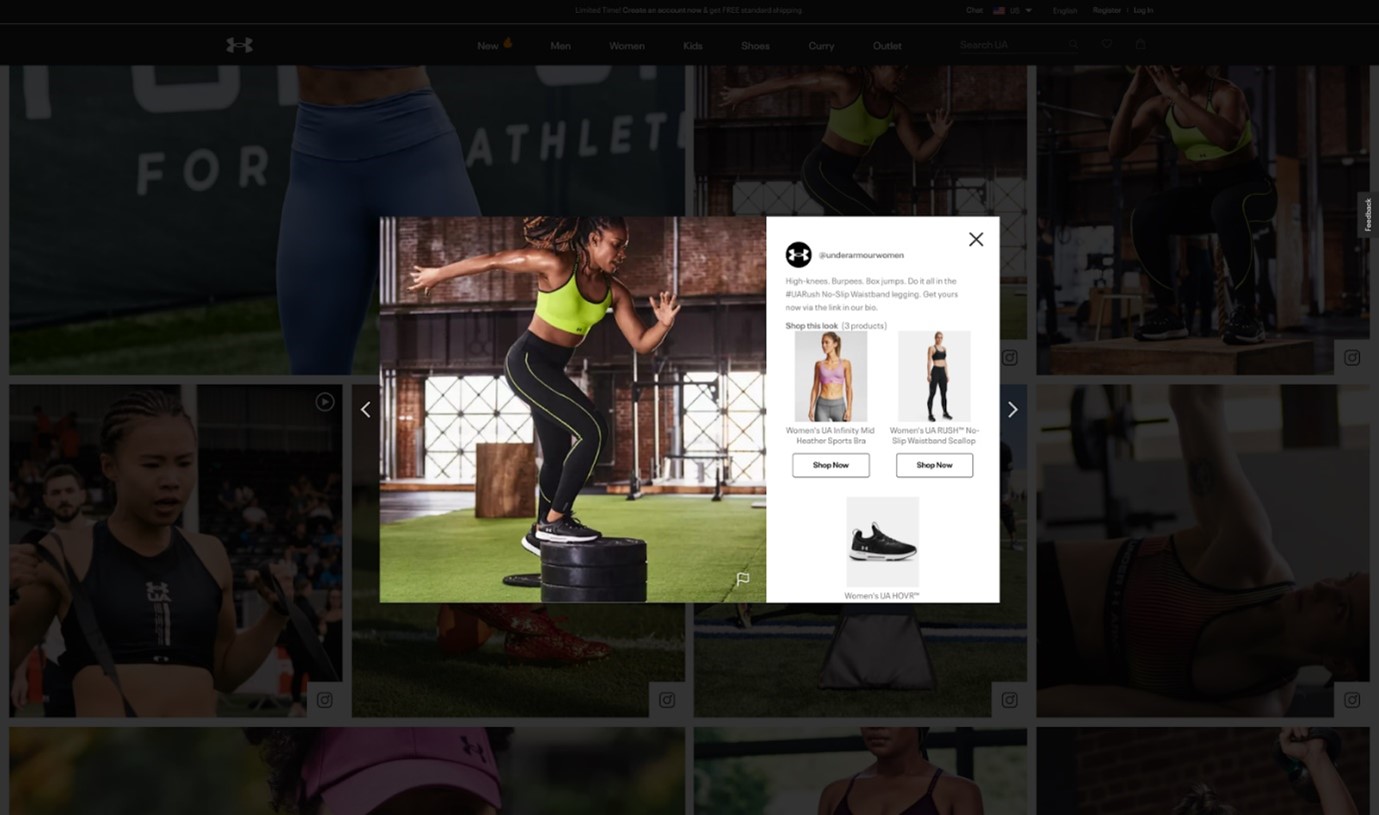
This, along with a clear prompt to facilitate user-generated content, helps bridge the divide between Under Armour’s digital channels.
Taking this even further, Under Armour now offers a branded app specifically focused on facilitating purchases.
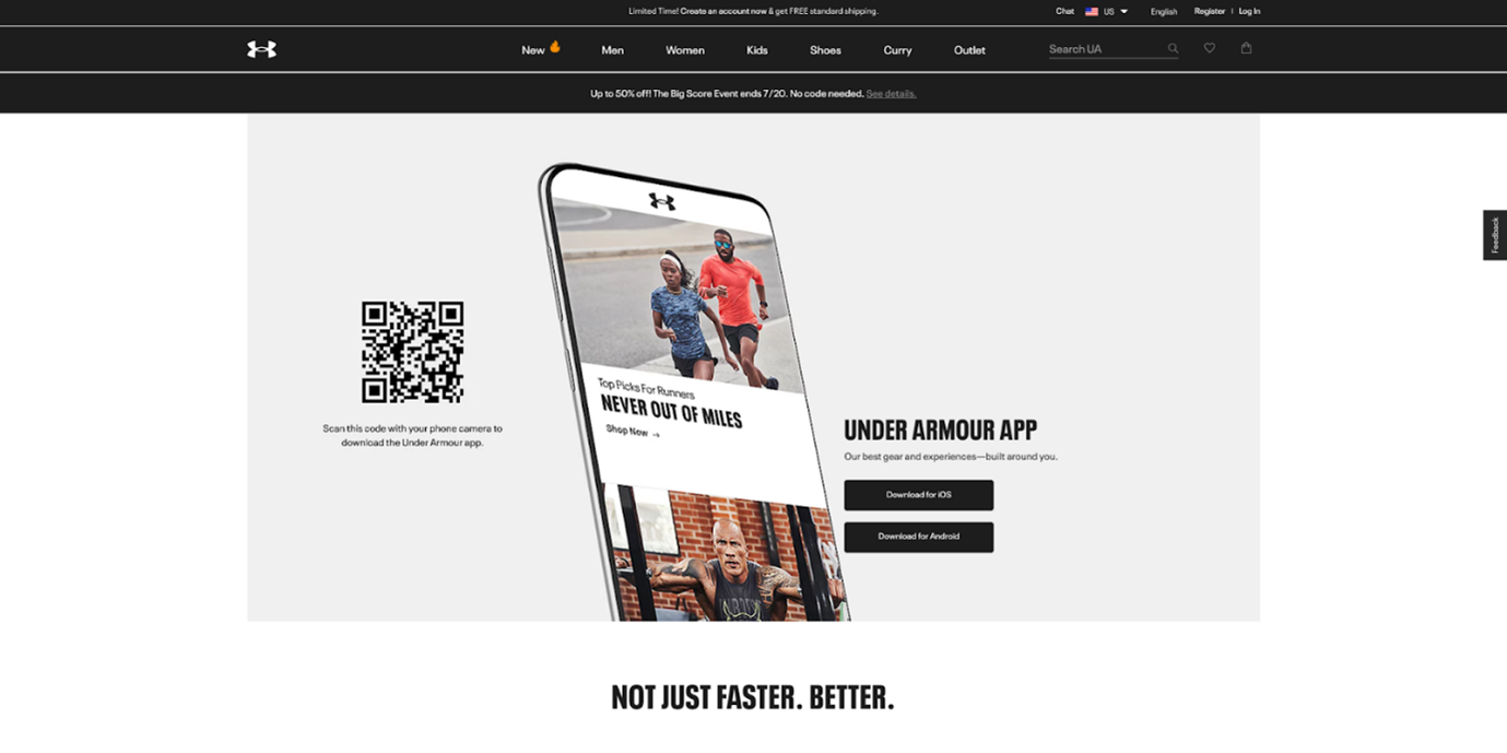
From new gear alerts to customized product recommendations, to a seamless in-app checkout process, Under Armour’s app adds yet another way for customers to engage and do business with the brand.
On that note, UA has pared down on the number of supplemental apps it offers — now maintaining a clear focus on its MapMyRun app.
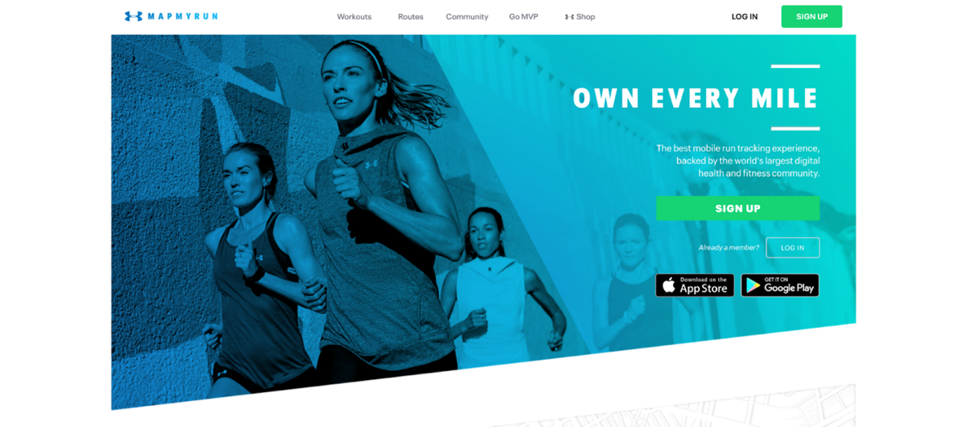
As shown above, here’s where UA’s customers can go to get helpful fitness-related content and other information. It’s also yet another spot where consumers can connect and continue to help the Under Armour community grow ever larger.
Individual customers can also use the MapMyRun app in conjunction with Under Armour’s smart apparel for a truly immersive fitness experience.
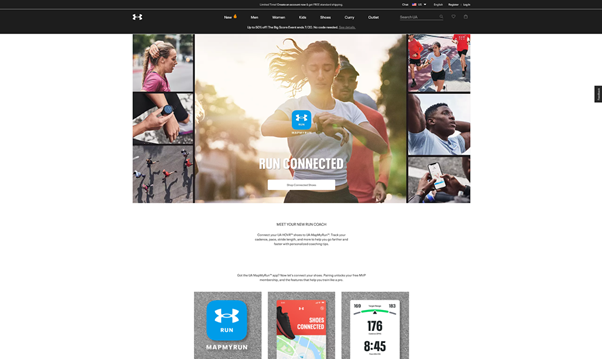
With all this in mind, it’s really no surprise that Under Armour’s eCommerce initiatives have proven to be the saving grace for the company in recent years. Even as the brick-and-mortar world opens back up, we’re likely to see Under Armour continue to focus on delivering a highly connected digital experience to its audience.
Of course, only time will tell what the always-innovative apparel company has up its sleeve next.
The post Wayback Machine: Documenting Under Armour’s Success in eCommerce appeared first on Post Funnel.


