What’s in this article:
- In this series, we take a look at how various brands’ website and digital efforts have evolved over the years
- Here, we look at how Kohl’s online presence has evolved since its humble beginnings back in 1998
If you’re part of Kohl’s financial team, you’re probably pretty happy with where things currently stand for your company.
After all, the popular department store has seen a 100% increase in digital sales over the last five years. This is coming off a lengthy period of less-than-stellar sales numbers — and coming on the heels of a major reinvestment into the company’s eCommerce initiatives.
Today, Kohl’s offers a revamped digital experience to its customers, which includes:
- A streamlined and immersive mobile experience
- Personalized recommendations and digital content
- Loyalty programs tailored to the online consumer
Kohl’s is also making improvements to its fulfillment processes, specifically focusing on optimizing deliveries for purchases made online. This involves the opening of its sixth eCommerce fulfillment center, and the use of automation technology throughout processing and delivery.
That said, finding success in the eCommerce realm has been a long journey for the Kohl’s team. Here, we’ll take a look at how Kohl’s website has evolved over the years to eventually become the retail powerhouse it currently is today.
Let’s get started.
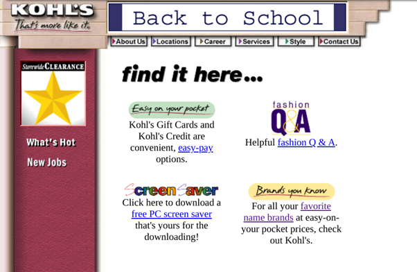
1998-1999: A Simple Beginning for Kohls.com
Back in 1998, the Kohl’s website was…well, pretty much what you’d expect from the late-90s version of a department store website.
Basically, the site served as an informational hub for both new and existing customers alike. Those looking for a list of brands carried in-store or info on current promotions being offered could quickly find exactly what they were looking for.
But the presentation was certainly lacking.
Even with the now-missing images in place, most pages on Kohls.com at this point consisted of information being listed haphazardly, with minimal concern for aesthetics.
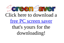
However, Kohl’s did show some early signs of digital content marketing, offering fashion advice to site visitors — along with a branded screen saver to keep the brand top-of-mind.
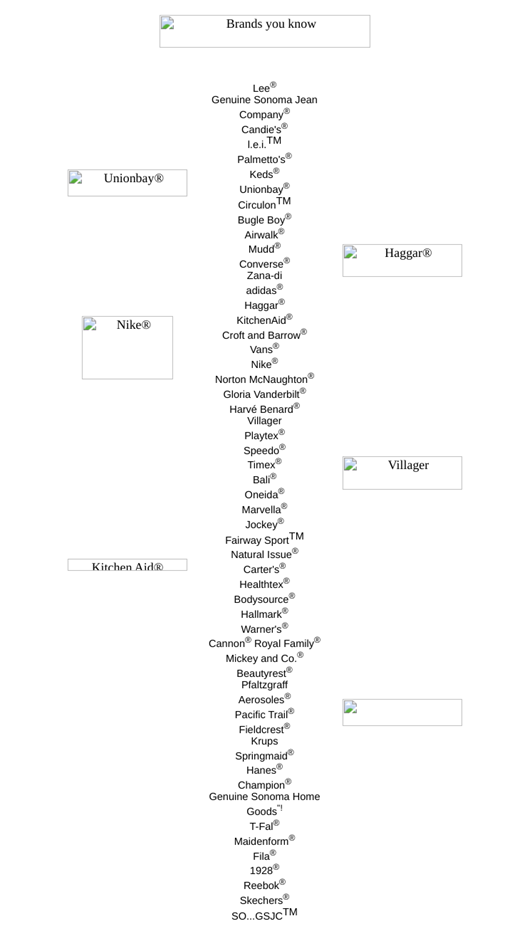
It’s also worth noting that, at this point, Kohl’s was beginning to focus on digital engagement and eCommerce and offerings. Though customers couldn’t yet buy products online, they could purchase gift cards via Kohl’s website. Kohl’s digital gift registry also added another layer of engagement to the in-store experience, as well.
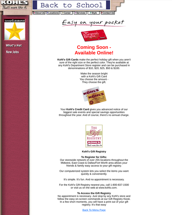
Sure, the original incarnation of Kohl’s website isn’t much to look at by today’s standards. But, even at this stage, it’s clear that the Kohl’s team understood just how crucial it would be to continue investing in its online initiatives moving forward.
Become the best CRMer you can:
CRM Hack: Monitoring the User’s Heartbeat
What Does It Mean to Treat a Customer’s Email With Respect?
To Lock or Not to Lock Customers (into CRM Journeys)
What the Efforts to Promote Responsible Gaming Look Like Form the Inside
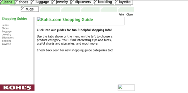
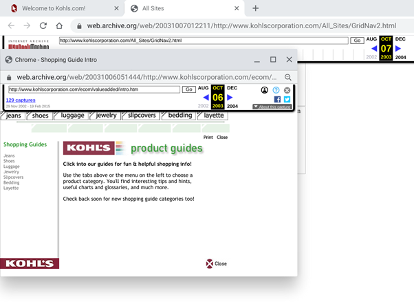
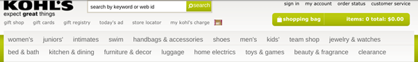
2001: Aesthetics, Content, and Digital Experiences at Kohls.com
(Note: Some images were not archived for this version of the site.)
A few years after their initial foray into the digital realm, the team at Kohl’s made some major changes to the appearance and functionality of their website.
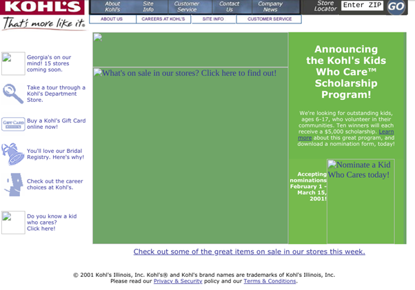
In terms of appearance, there’s much more focus on page structure and the use of graphics to deliver a consistent, branded experience to site visitors. For the most part, each page maintained a similar structure and appearance while delivering the necessary information:
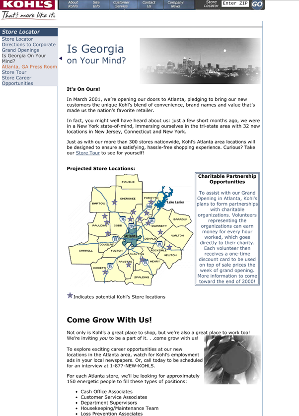
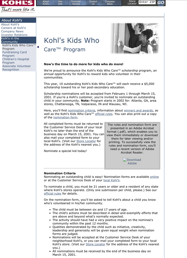
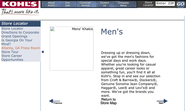
Images were also used more intentionally and practically at this point, too. For example, the site offered a store map, allowing visitors to click on the department of their choice for more information.
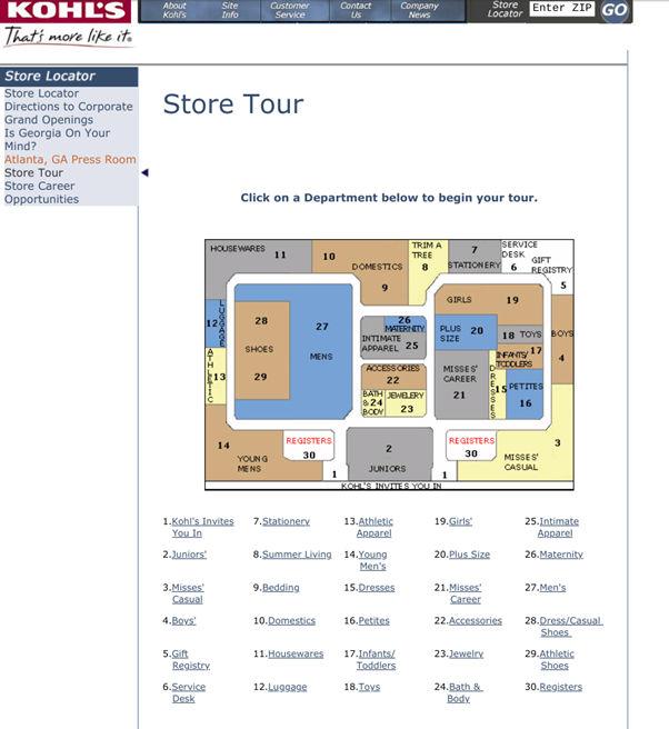
These pages also show how the team at Kohl’s had begun focusing more on delivering in-depth, relevant content to its on-site customers. Each department’s page, for example, showcased specific information regarding available brands and products offered.
(In contrast to the rather disorganized list of brands provided in the site’s previous iteration, this is certainly a major improvement.)
The site also became a bit more organized in how it presented different types of content and information, as well. Clicking on each header button, for example, would bring the user to a dedicated section of the site — where they could then intuitively dive further into more specific content as needed.
At this point, the Kohl’s team had clearly realized the importance of delivering valuable, need-to-know information to its online audience.
And, for the time being, what they offered on that front was pretty impressive.
Still, it would be a couple more years before Kohl’s dove into the world of eCommerce.
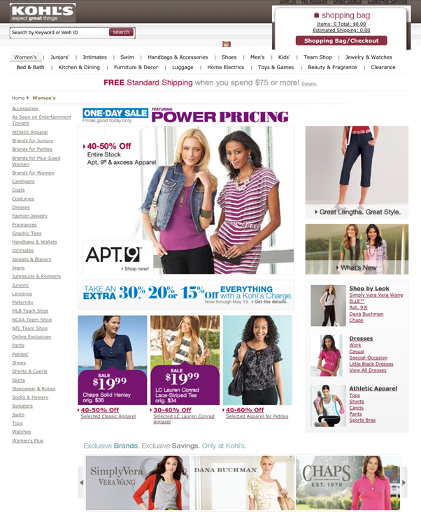
2003: Kohls.com Joins the eCommerce Bandwagon
By 2003, the writing was on the wall for the team at Kohl’s:
To succeed as a retailer moving forward, they needed to hop on the eCommerce bandwagon.
Which they did in full:
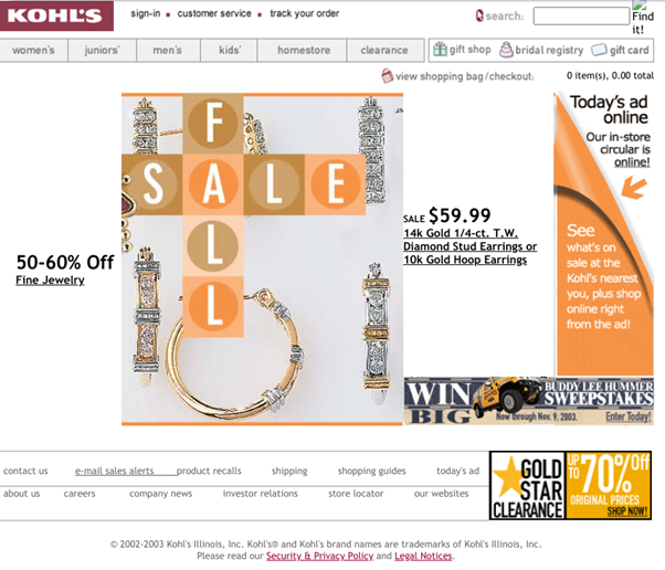
With the next iteration of their site, the team at Kohl’s shifted its focus almost entirely to promoting sales — both on- and offline.
Most obviously, the majority of the homepage had become dedicated to products (as opposed to a mixture of “all things Kohl’s”, as the homepage had previously been). In addition to the main images and links provided, the site’s header had also become more product-centric, as well.
The addition of a search bar allowed site visitors to quickly find the exact brands and products they were looking to buy at the time. Those just looking to peruse Kohl’s’ product catalog could do so at their leisure.
(Obviously, the team had to take a more organized and user-friendly approach to presenting its products to spur online sales. A haphazard list of brands would no longer do.)
As you may have noticed, Kohl’s had also added an online bridal registry to its website — a clear evolution of its formerly in-store digital registry service. Site visitors could also purchase gift cards directly online at this point — or could check out the product-centered gift guides offered on the Kohl’s website for help finding the perfect present for their loved ones.
With products taking up much of the limelight, Kohl’s on-site content ended up taking a backseat. However, this content was still readily available for anyone who needed it.
One minor annoyance encountered at various points on Kohl’s’ website back in 2003:
Some links opened up entirely new browser windows, while others navigated to the next page directly.
As far as we can tell, there doesn’t seem to be much rhyme or reason behind how this worked; some pages were simply presented in new windows, while others were not. Unfortunately, this often interrupted the flow of the overall user experience — and was likely quite a turn-off for visitors at the time.
Overall, Kohl’s initial voyage into the eCommerce realm delivered pretty much what we’d expect from a retailer in the early 2000s. Unfortunately, hindsight (and Kohl’s subpar digital performance in the years to come) shows that doing “what’s expected” wasn’t exactly enough to set the company apart from its competition.

2010: Planting Seeds for the Future of Kohls.com
By 2010, Kohls.com had gone all-in on eCommerce.
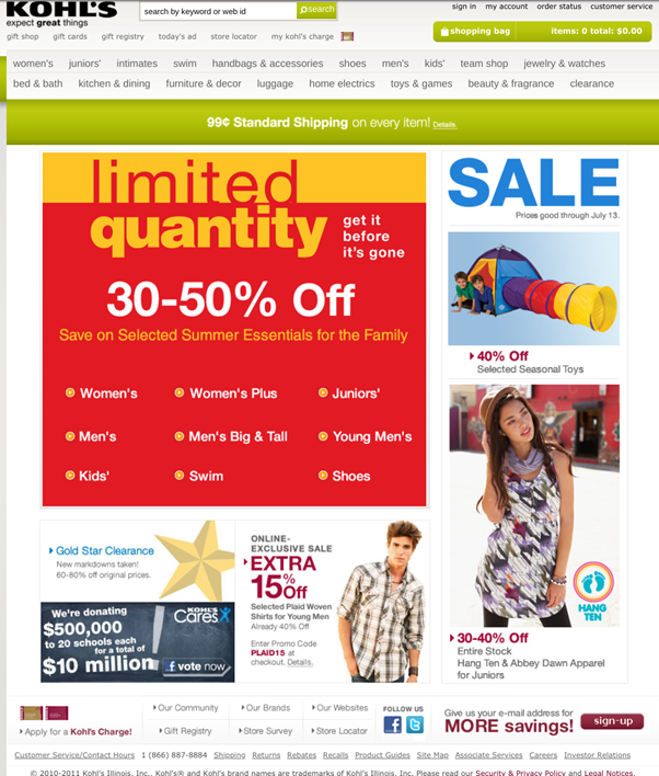
Promotional sales — a trademark of Kohl’s — maintain center stage, with the homepage pointing visitors to all types of discounts and offers.
- Limited quantity sales
- Seasonal promotions
- Online-only offers
…and more.
Kohl’s had also begun promoting its affordable shipping rates — complete with a guide for those looking for the best offer for their needs.
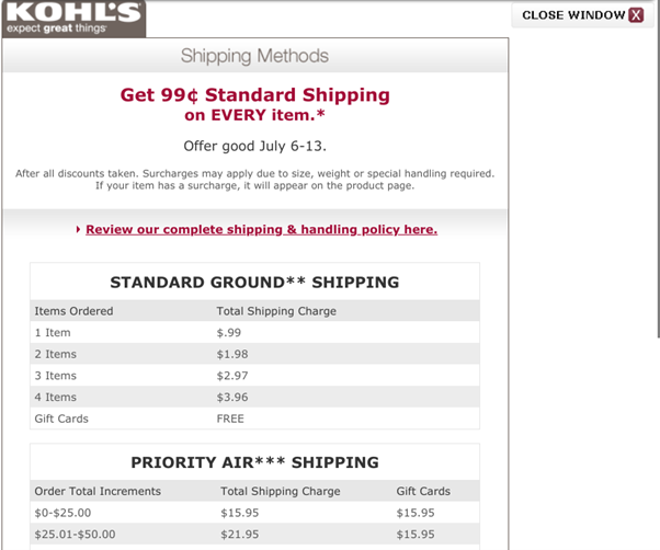
Note that this information also pops up in a new window, as we’d discussed earlier. However, it’s a bit more intuitive in this situation — and not nearly as disruptive as it had been with previous versions of the site.
Site navigation, oddly enough, became both easier and more difficult with this iteration of Kohls.com.
On the one hand, the clearly labeled header tabs allowed site visitors to quickly navigate to the correct product category pages as needed.
On the other hand, the homepage’s main content is a bit confusing to navigate. Though each department (e.g., Women’s, Men’s, Kids’, etc.) is clickable, this isn’t exactly clear at first glance.
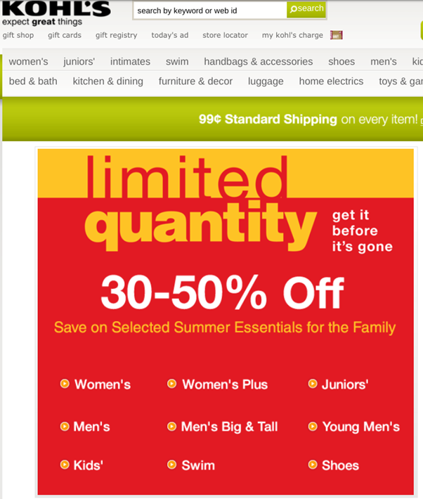
Though a rather minor misstep, the lack of clarity here could potentially have caused site visitors to become frustrated right from their very first click after landing on the homepage.
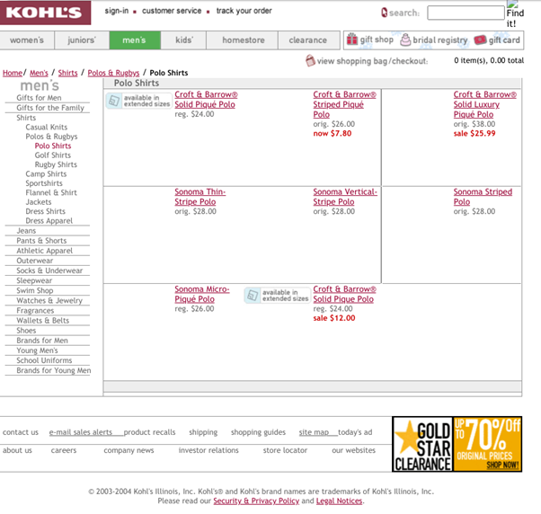
That said, the actual product category pages had seen a major improvement by 2010.
At this point, each category page had essentially become a microsite in itself:
On most category pages, customers could easily find:
- Sales and promotions related to the products in focus
- Information about specific brands carried by Kohl’s
- Purchasing guides for various personas and use cases
The Kohl’s team had also started to focus on increasing digital engagement among its audience members at this point. Back on the homepage, visitors could quickly sign up for Kohl’s mailing list, and could also visit the brand’s Facebook and Twitter pages.
![]()
In providing these additional modes of engagement, Kohl’s set the stage for a truly omnichannel digital customer experience.
2015: Kohls.com Continues to Evolve
By 2015, Kohls.com had taken on a more modern look and feel:
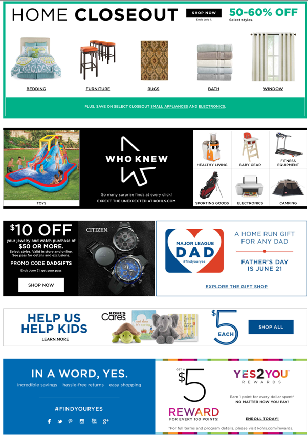
As you can see, the homepage at this point was quite busy, to the point of being overwhelming. More than just the homepage’s appearance, the various discounts and promos being showcased can also potentially distract visitors from doing what they set out to do.
Still, this version of the homepage is much more intuitive than the previous version. While there is a lot to digest, each element of the site is clearly sectioned-off and labeled to ensure visitors can get where they want to be on-site.
The drop-down menus added to the header element also enhance the site’s overall navigability:
(These drop-down menus also served to decrease clutter at the top of the homepage, too.)
Product category pages also continued to evolve, with many providing information on trending products, product-focused tips, and shopping guides.
Similarly, Kohl’s began offering product suggestions within their product category and product pages based on the customer’s interests and browsing history.
For the customer, this meant more relevant and laser-focused value. For Kohl’s’ team, it meant more up- and cross-selling opportunities across the board.
Finally, Kohl’s had at this point begun offering BOPIS services, allowing online shoppers to retrieve their purchases in person at their local storefront. This, incidentally, would pave the way for Kohl’s to partner with Amazon to offer BORIS services to consumers in 2017.
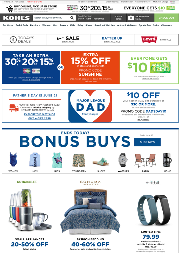
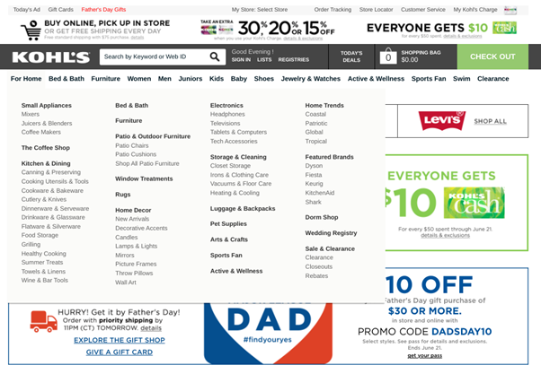
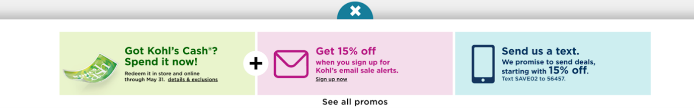
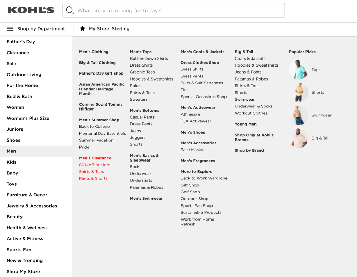
2021: Today’s Kohls.com
As we said in the intro, the Kohl’s team has invested heavily into optimizing its website and overall digital presence — and seems to have figured out how to make it all work.
As with many other retailers, Kohl’s current homepage offers a ton of information and navigational options to site visitors. As jam-packed as the homepage is, both vertical scrolling and horizontal carousels (and whitespace) are used to space things out and minimize clutter.
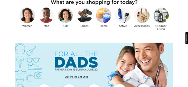
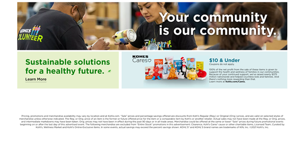
In addition to the various promotional offers, some key homepage elements to point out include:
- Transactional info (e.g., BOPIS/BORIS options, mobile payment options, etc.)
- Social media content and user-generated content
- Info regarding brand community initiatives
The “pull-up” footer element also provides multiple ways for customers to earn discounts by completing certain tasks on Kohl’s’ various channels.
(The homepage also promotes Kohl’s’ social media channels, as well as its mobile app, throughout.)
Product category pages are again accessible via drop-down menu — which also serves to minimize clutter on the homepage.
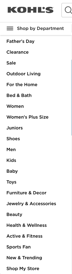
However, the sub-menus are a bit cluttered — and the hover mechanism potentially makes navigating these menus rather frustrating.
Still, those who know exactly what they’re looking for should easily be able to navigate to the right page from the get-go.
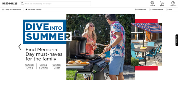
Finally (and perhaps most surprisingly), Kohl’s category pages have simultaneously evolved while also leaving a lot of room for improvement.
Take, for example, this page focused on outdoor/camping gear:
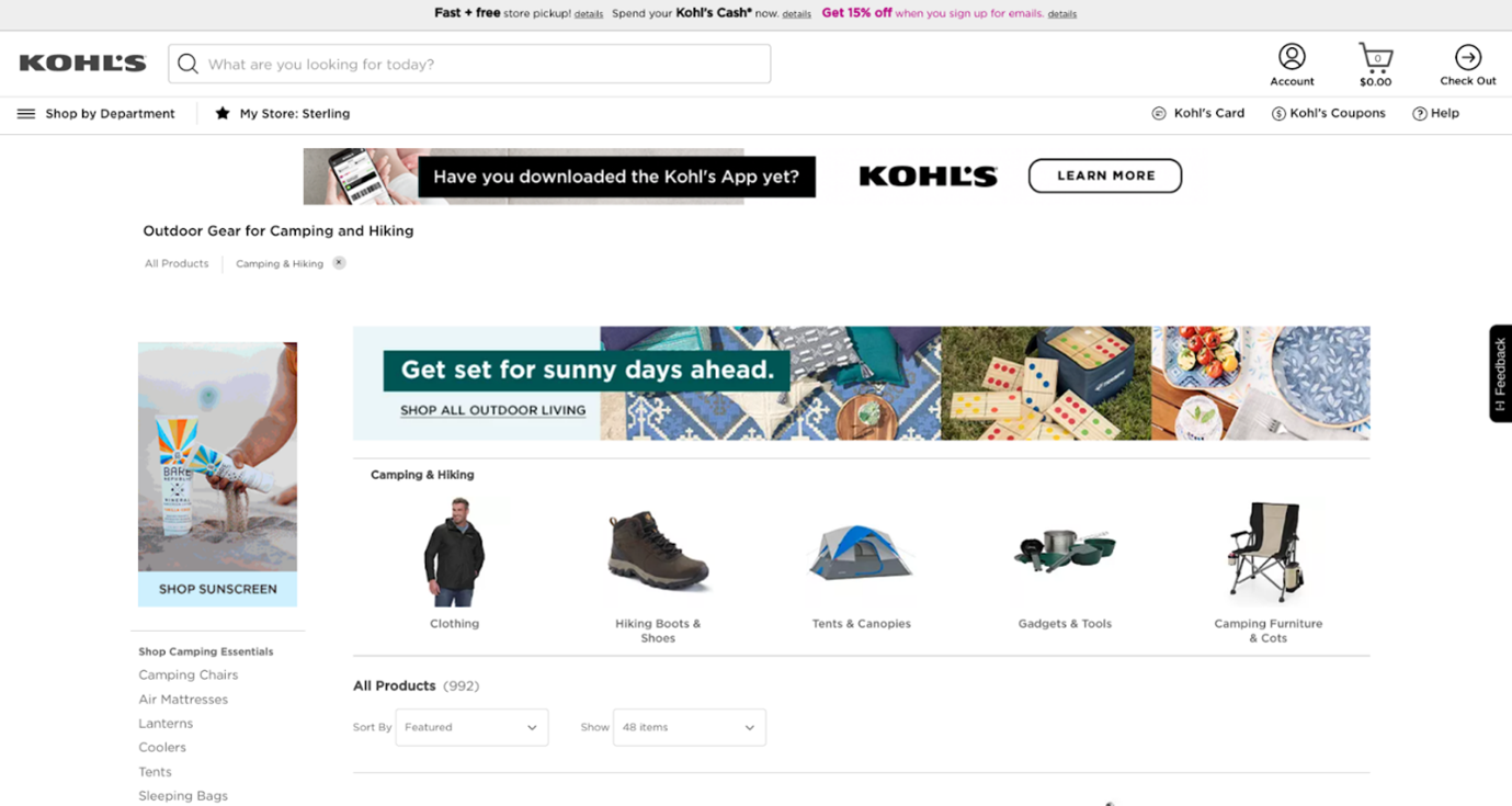
For one thing, the “Everyone’s Loving These” section is completely out of place, as it promotes products that have nothing at all to do with camping. To be frank, it’d be surprising if this section generated any sort of additional engagement whatsoever.
More importantly, though, is the rather haphazard approach to delivering helpful content here. Sure, the checklist and quick tips are helpful — but they’re presented in a way that makes the content feel like an afterthought. Overall, the content would be more engaging (and more valuable) if presented in the form of blog posts, a la LL Bean.
That being said, Kohl’s has proven to be on the right path as far as their eCommerce efforts are concerned. In taking a more customer-centric, omnichannel approach to engaging with its audience, Kohl’s is primed to re-emerge as a force to be reckoned with in the retail world.
Hopefully, the team can use the momentum they’ve created in recent years to continue building toward a successful future for the company and their customers.
The post Wayback Machine: Kohl’s Digs Deep to Enhance Digital Sales appeared first on Post Funnel.
![Read more about the article 9 Creative Company Profile Examples to Inspire You [Templates]](https://www.dimaservices.agency/wp-content/uploads/2021/09/36373029-eb12-499a-a9f3-e1da153f253e-300x33.png)