Color wields enormous sway over our attitudes and emotions.
When our eyes take in color, they communicate with a region of the brain known as the hypothalamus, which sends a cascade of signals to the pituitary gland, on to the endocrine system, and then to the thyroid glands. The thyroid glands signal the release of hormones, which cause fluctuation in mood, emotion, and resulting behavior.
What is even more interesting is that a case study showed that adjusting color, among other elements, can increase conversion by as much as 24%.
The study of all this is called color psychology, and the bottom line is: use the right colors, and you win.
What is Color Psychology?
Color psychology is the science of how color affects human behavior. Color psychology actually is a branch of the broader field of behavioral psychology. Suffice it to say that it’s a pretty complicated field.
Some skeptics are even dismissive of the whole field of color psychology due to the difficulty of testing theories.
My own research on the topic, as this article conveys, lacks scientific evidence to back up every claim. But that alone is no reason to dismiss the profound and unarguable effect that color has on people.
There are key facts of color theory that are indisputable. In a classic study on color in a peer-reviewed journal article, Satyendra Singh determined that it takes a mere 90 seconds for a customer to form an opinion about a product. And, 62-90 percent of that interaction is determined by the color of the product alone.
Color psychology is a must-study field for leaders, office managers, architects, gardeners, chefs, product designers, packaging designers, store owners, and even expectant parents painting the nursery for the new arrival! Color is critical. Our success depends upon how we use color.
However, the psychology of color is often a subject of disagreement in marketing and website design because color preference varies widely between individuals. For example, many people prefer red to blue, while even conjoined twins might prefer different t-shirt colors.
Where Should You Use Color Psychology?
Colors impact everyone. It doesn’t matter whether you’re developing software, designing a book, developing a web design cover, or simply branding your business: colors define mood and influence responses.
Since color is ubiquitous, we need to understand where you should use these color tips. This article discusses the use of color in website design. Specifically, we’re talking about the color scheme of a website, which includes the tint of hero graphics, headline type, borders, backgrounds, buttons, and popups.
In the example below, NinjaJump uses a green-yellow-red color scheme in its logo, phone number, video C2A, menu bar, graphics, category menu, subheadings, and sidebar.
The tips that we discuss below can be applied in similar ways across a wide range of areas, including:
- Websites
- Logos
- Branding
- Landing pages
- Menu bars
- Email marketing
- Social media posts and cover photos
- Product design
- Videos
As you can see, color psychology can be used just about anywhere. So, how do you get it, right?
Using the Right Color Psychology the Right Way
Color is a tricky thing. You have to use it in the right way, at the right time, with the right audience, and for the right purpose.
For example, if you are selling bouncy jump houses — those things kids play in — you don’t want to use a black website. Props, NinjaJump.com.
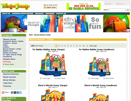
For the jump house site, you want lots of bright and vibrant colors, probably some reds, greens, and maybe a splash of yellow for good measure.
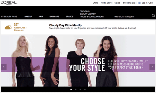
If, on the other hand, you’re selling a product to women, you don’t want to use brown or orange. Maybe that’s why L’Oreal uses black and white, with purple overlay, in their e-commerce homepage.
I’ll explain all the tricks below. To succeed at using the right color psychology, you need to follow these core principles:
- The right way
- The right time
- The right audience
- The right purpose
Here are some tips the pros use to leverage color psychology to improve conversion.
Proven Color Psychology Tips to Drive Conversions
CRO is an integral part of building a successful website. The goal is to get the best ROI possible and to thrive, no matter how strong your competition might be.
Since less than 5% of the population suffers from color blindness, color theory is an option that should be explored — and tested.
Here are a few color psychology tips to keep in mind.
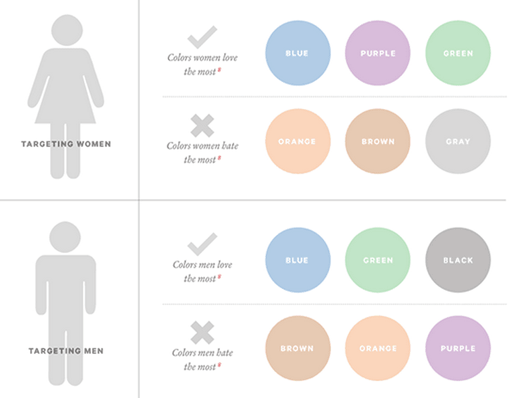
1. Women Prefer Blue, Purple, and Green
The sociological differences between color preferences is a whole branch of study unto itself.
In a survey on color and gender, 35% of women said blue was their favorite color, followed by purple (23%) and green (14%). 33% of women confessed that orange was their least favorite color, followed by brown (33%) and gray (17%).
Other studies have corroborated these findings, revealing a female aversion to earthy tones and a preference for primary colors with tints.
Look at how this is played out. Visit nearly any e-commerce site whose target audience is female, and you’ll find these female color preferences affirmed.
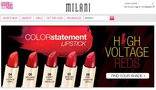
Milani Cosmetics has a primarily female customer base. Thus, there’s not a shred of orange, gray, or brown on the homepage:
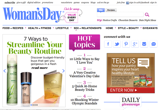
Woman’s Day uses all three of the favorite colors of women (blue, purple, and green) on their homepage, thus inviting in their target audience:
Most people think that the universally-loved female color is pink. It’s not. Just a small percentage of women choose pink as their favorite color.
Thus, while pink may suggest femininity in color psychology, this doesn’t mean that pink is appealing to all women, or even most women. Use colors other than pink — like blue, purple, and green — and you may improve your e-commerce website’s appeal to female visitors. That may, in turn, improve conversions.
2. Men Prefer Blue, Green, and Black
If you’re marketing to men, these are the colors to stay away from purple, orange, and brown. Instead, use blue, green, and black. These colors — blue, green, and black — are traditionally associated with maleness. However, it comes as a slight surprise to some that brown isn’t a favorite pick.
Keep in mind that gender preferences are not cut and dry. Gender is a complex topic, and not all men or women will prefer the colors above. However, this information can serve as a starting point for A/B testing.
3. Use Blue to Cultivate Trust
Blue is one of the most-used colors, with good reason. A lot of people like blue.
Read the literature on blue, and you’ll come across messages like
- The color blue is a color of trust, peace, order, and loyalty.
- Blue is the color of corporate America, and it says, “Chill . . . believe and trust me . . . have confidence in what I am saying!”
- Blue calls to mind feelings of calmness and serenity. It often is described as peaceful, tranquil, secure, and orderly.
There is wide agreement in the research community on the psychological effects of the color blue. Its subtle message of trustworthiness and serenity is true. You can use this to your advantage on your website and landing pages.
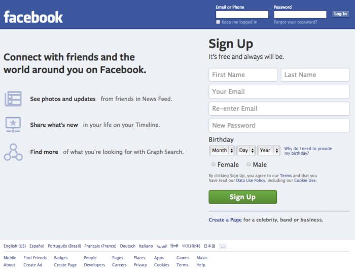
The world’s biggest social network is blue. For a company whose core values are transparency and trust, this probably is not an accident.
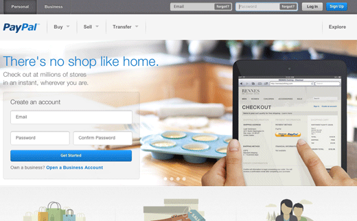
A company that serves as a conduit for billions of dollars, PayPal, also prefers the color blue. Chances are, this helps to improve their trustworthiness. If they were to try, say, red or orange as the theme color and branding, they probably wouldn’t have the same conversion level.
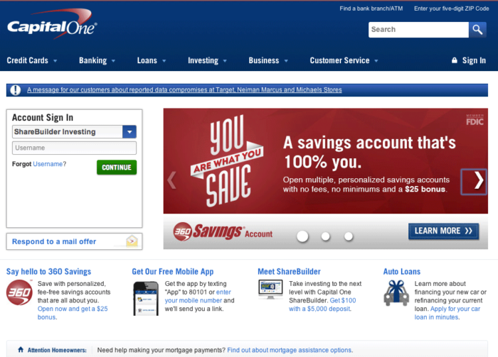
Blue is, in fact, a color heavily used by many banks. Here’s CapitalOne.com, a major Internet bank:
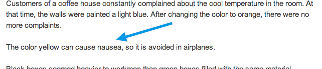
Although blue is pretty much an all-around great color, it should never be used for anything related to food. Dieters have used blue plates to successfully prevent them from eating more.
Evolutionary theory suggests that blue is a color associated with poison. There aren’t very many blue foods — blueberries and plums just about cover it. Thus, never use blue if you’re selling foodie stuff. (Use red instead.)
4. Yellow is for Warnings
Yellow is a color of warning. Hence, the color yellow is used for warning signs, traffic signals, and wet floor signs.

It seems odd, then, that some color psychologists declare yellow to be the color of happiness. Business Insider reports that “brands use yellow to show that they’re fun and friendly.” There is a chance that yellow can suggest playfulness. However, since yellow stimulates the brain’s excitement center, the playfulness feeling may be simply a state of heightened emotion and response, not exactly sheer joy.
Color psychology is closely tied to memories and experiences. If someone had an enjoyable experience with someone wearing a yellow shirt, eating at a fast-food establishment with yellow arches, or living in a home with yellow walls, then the yellow color may cause joy by memory association.
One of the most-cited “facts” about the color yellow is that it makes babies cry and people angry. To date, I have not found any study that backs up this claim, even though everyone is fairly comfortable repeating it.
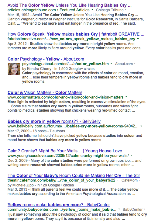
I’ve even read that “the color yellow can cause nausea,” though I’m doubtful about this.
If you find the study about cranky babies and angry people living in yellow-walled houses, please let me know. I’m pretty sure that babies are going to cry, and people are going to get ticked, regardless of the paint color.
Whatever the case, it seems true that “yellow activates the brain’s anxiety center,” as reported by one color expert.
A heightened anxiety level during any website experience is never a good thing unless it comes in small doses. Thus, a yellow call to action may create just a touch of anxiety needed to make them click the desired call to action.
Use yellow in small doses unless you want to cause unnecessary anxiety.
5. Green is Ideal for Environmental and Outdoor Products and Brands
Perhaps the most intuitive color connection is green — the color of outdoors, eco-friendly, nature, and the environment. Green essentially is a chromatic symbol for nature itself.
Apart from its fairly obvious outdoorsy suggestiveness, green also is a color that can improve creativity. Labeled “the green effect,” one peer-reviewed study indicated that participants had more bursts of creativity when presented with a flash of green color as opposed to any other color.
If your website’s focus has anything to do with nature, the environment, organic, or outdoors, green should be your color of choice.
Green isn’t just about nature, though. Green also is a good call to action color, especially when used in combination with the “isolation effect,” also known as the von Restorff effect, which states that you remember things better if they stand out.
You remember the Statue of Liberty because it’s big, tall, green, and there isn’t a whole lot of them in the New York Harbor. In color psychology, the isolation effect occurs when a focus item, such as a conversion step, is the only item of a particular color. The technique works wonders for calls to action, and green is an ideal choice.
Here’s how Conrad Feagin uses it:

All of Dell’s conversion elements are green.
The word “green” itself is a buzzword for environmental awareness and appreciation. Using the word and the color itself can lend an environmental aura to your website, improving your reputation among those passionate about environmental concerns.
5. Orange Can Create a Sense of Haste or Impulse
The positive side of orange is that it can be used as the “fun” color. According to some, orange helps to “stimulate physical activity, competition, and confidence.” This may be why orange is used heavily by sports teams and children’s products.
A great example is the Denver Broncos logo.
In fact, there are a ton of sports teams that use orange: Florida Gators, Clemson Tigers, Boise State Broncos, Syracuse, New York Knicks, New York Mets, Cleveland Browns, etc.
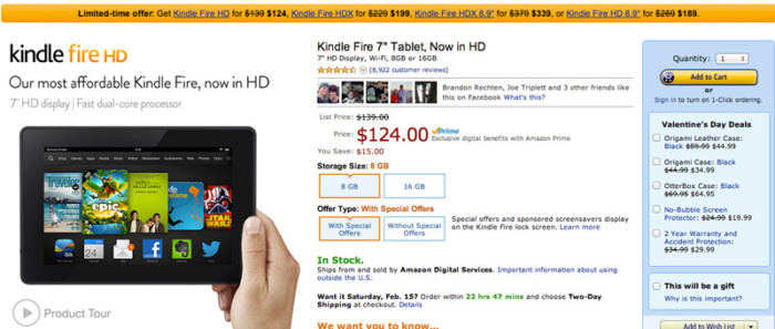
Amazon.com uses orange in their “limited time offer” banner. The color suggests urgency, which makes the message more noticeable and actionable:
It makes sense. Orange means active. Orange means fun. Orange means togetherness because it’s a loud and warm color.
However, orange can be slightly overwhelming. A research paper advises,
Orange will be used sparingly to bring your attention to something, but not so much as to overwhelm the actual message of the advert.
Sometimes, orange is interpreted as “cheap.” If your product offering is cheap, or if you want it to be seen as such, orange may be a good choice. Vive la Big Lots.
6. Black Adds a Sense of Luxury and Value
The darker the tone, the more lux it is, says our internal color psychology. Black can also be associated with elegance, sophistication, and power, which is exactly what luxury designers and high-end e-commerce sites want you to feel.
In a Business Insider piece on color and branding, the author relates the significance of black:
“Black can also be seen as a luxurious color. ‘Black, when used correctly can communicate glamour, sophistication, exclusivity.’”
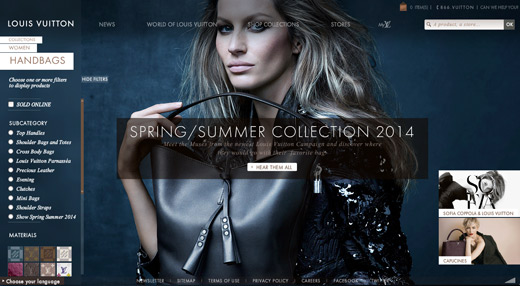
Louis Vuitton handbags are not cheap. Absent from the site are colors and designs of whimsy and fun. This is serious value:
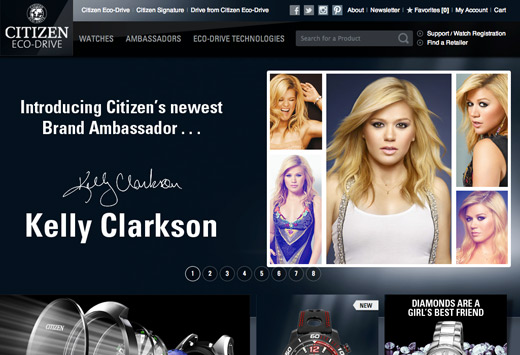
Citizen Watch, better than the average Timex, also uses the dark-tone website design:
Lamborghini does the same thing. Black is the name of the game:

If you sell high-value luxury consumer items on your website, black probably would be a good choice.
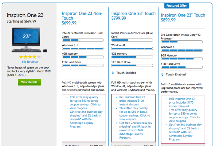
7. Use Bright Primary Colors for Your CTA
In strict testing environments, the highest-converting colors for calls to action are bright primary and secondary colors – red, green, orange, yellow.
Darker colors like black, dark gray, brown, or purple have very low conversion rates. Brighter ones have higher conversion rates.
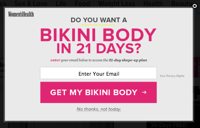
Women’s Health uses a bright mauve-tinted shade for their popup call to action. They’ve got the female-associated purple/pink tint going for them, along with a bright tone.
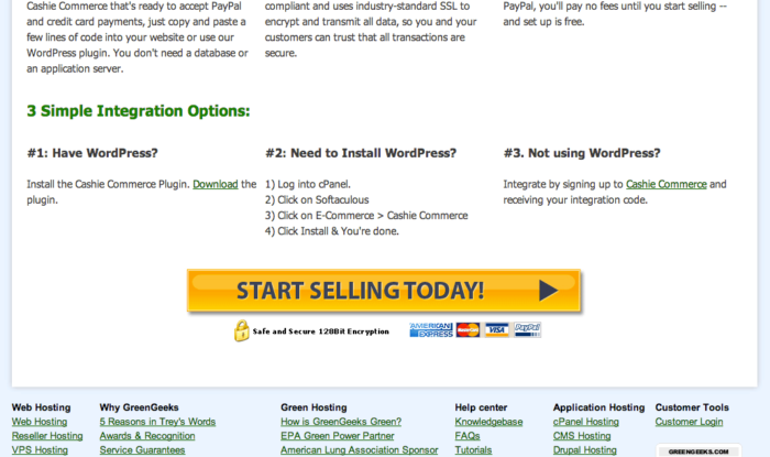
GreenGeeks uses a yellow button:
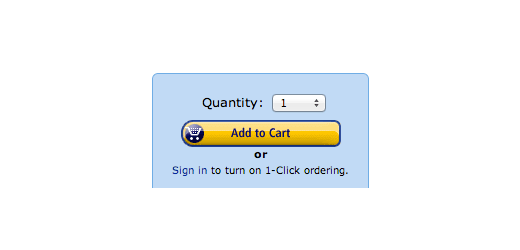
The biggest retailer in the world uses that famous “add to cart” button. It’s yellow:
Some of the best conversion colors are the “ugly” ones — orange and yellow. An article on ColorMatters.com states,
Psychologically, the ‘anti-aesthetic’ colors may well capture more attention than those on the aesthetically-correct list.
Since a conversion element’s goal is to capture attention, you may do just fine with that big orange button (BOB). Or yellow.
8. Don’t Neglect White
In most of the color psychology material I read, there is a forgotten feature. Maybe that’s because color theorists can’t agree on whether white is a color or not. I don’t really care whether it is or not.
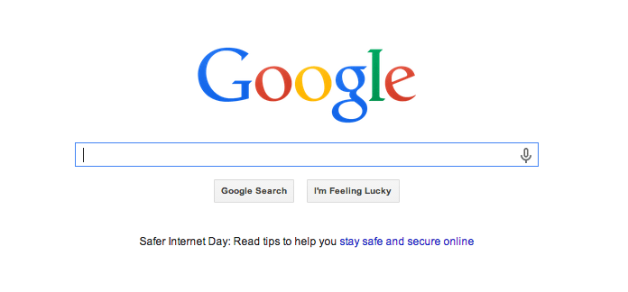
What I do know is that copious use of white space is a powerful design feature. Take, for example, the most popular website in the world. It’s basically all white:
White is often forgotten because its primary use is as a background color. Today, most well-designed websites use plenty of white space to create a sense of freedom, spaciousness, and breathability.
Color Psychology Best Practices to Drive Conversions
You may not be in a position to rewrite your style guide and pick your own website color palette or font colors on the email template. So, how can you use color psychology in these situations? There are a few options:
- If the colors really suck, campaign for change. In some situations, you may need to make a difference. If you’re a high-heel designer selling to upscale women but have a crappy orange logo, share your concerns with the decision-makers. People sometimes make terrible color decisions. Kindly show them how a killer color scheme can make a conversion difference.
- Use psychology-appropriate colors that match the existing color scheme. Sure, you need to adapt to the color scheme, but you can still use a splash of strategic color here and there. Let’s say, for the sake of example, that you have a blue-themed website. Fine. You can create a popup to harvest email addresses and use a bright yellow button. The button is psychology-appropriate, and it doesn’t do damage to the company’s color branding.
The more freedom you have in your color scheme, the better. Here are some solid takeaways as you implement color psychology into your website:
- Test several colors: Despite what some may say, there is no right color for a conversion text or button. Try a green, purple, or yellow button. Explore the advantages of a black background scheme vs. a white background. Find out which works best for your audience and with your product.
- Don’t just leave the color choice up to your designer: I have enormous respect for most web designers. I’ve worked with many of them. However, don’t let your designer dictate what colors you should use on your website. Color is a conversion issue, not just an “Oh, it looks good” issue. Color aesthetics is not everything. Color conversion effects are important! You should be heavily involved in the color selection of your landing pages to improve your conversions.
- Avoid color overload: I’ve just spent over 3,000 words telling you how important an awesome color is. Now, you’re going to go out and color something. But don’t go overboard. Remember my final point. I put it last for a reason. White is a color, and it should be your BFF color, too. Reign in your color enthusiasm with a whole lot of white. Too many colors can create a sense of confusion.
Conclusion
The Internet is a colorful place, and there is a lot that can be accomplished by using color correctly, at the right time, with the right audience, and for the right purpose.
Naturally, this article leads to questions about making changes in your company’s context. What about if your company has a specific color in your style guide? What if the logo color dictates a certain tint? What if the lead designer dictates color requirements? How do you deal with that?
How have your color changes affected your conversions?
The post How to Use the Psychology of Color to Increase Website Conversions appeared first on Neil Patel.