There are various ways to understand the effectiveness of your sales team activity or how well sales teams are at driving sales to reach operational and financial goals. Sales forecasting, a method that predicts sales performance based on historical performance, is one way to get this understanding.
Sales forecasting is important because it can help you identify what is going right, as well as what areas of your current strategy need to be adapted and changed to ensure future success.
For example, if your team is consistently below quotas, sales forecasting can help determine where and why these issues are happening. Forecasting can also help you decide on future business endeavors, like when you’d have the revenue to invest in new products or expand your business.
Some forecasting methods involve doing basic math, like adding up month to month sales, and others are more in-depth. Regression analysis is one of these methods, and it requires in-depth statistical analysis.
If you’re anything like me and not at all mathematically inclined, conducting this type of forecast may seem daunting. Thankfully, this piece will give an easy to understand breakdown of regression analysis in sales and guide you through an easy to follow example using Google Sheets.
What is regression analysis?
In statistics, regression analysis is a mathematical method used to understand the relationship between a dependent variable and an independent variable. Results of this analysis demonstrate the strength of the relationship between the two variables and if the dependent variable is significantly impacted by the independent variable.
There are multiple different types of regression analysis, but the most basic and common form is simple linear regression that uses the following equation: Y = bX + a
That type of explanation isn’t really helpful, though, if you don’t already have a grasp of mathematical processes, which I certainly don’t. Let’s take a look at what regression analysis means, in layman’s terms, for sales forecasting.
Independent and dependent variables are still at play here, but the dependent variable is always the same: sales performance. Whether it’s total revenue or number of deals closed, your dependent variable will always be sales performance. The independent variable is the factor you are examining that will change sales performance, like the number of salespeople you have or how much money is spent on advertising.
Sales regression forecasting results help businesses understand how their sales teams are or are not succeeding and what the future could look like based on past sales performance. The results can also be used to predict future sales based on changes that haven’t yet been made, like if hiring more salespeople would increase business revenue.
So, what do these words mean, math wise? Like I said before, I’m not good at math. But, I did conduct a simple sales regression analysis that is easy to follow and didn’t require many calculations on my part. Let’s go over this example below.
How To Use Regression Analysis To Forecast Sales
Let’s say that you want to run a sales forecast to understand if having your salespeople make more sales calls will mean that they close more deals. To conduct this forecast, you need historical data that depicts the number of sales calls made over a certain period. So, mathematically, the number of sales calls is the independent variable, or X value, and the dependent variable is the number of deals closed per month, or Y value.
I made up the data set below to represent monthly sales calls, and a corresponding number of deals closed over a two year period.
So, the overall regression equation is Y = bX + a, where:
- X is the independent variable (number of sales calls)
- Y is the dependent variable (number of deals closed)
- b is the slope of the line
- a is the point of interception, or what Y equals when X is zero
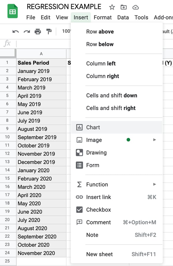
Since we’re using Google Sheets, its built-in functions will do the math for us and we don’t need to try and calculate the values of these variables. We simply need to use the historical data table and select the correct graph to represent our data. The first step of the process is to highlight the numbers in the X and Y column and navigate to the toolbar, select Insert, and click Chart from the dropdown menu.
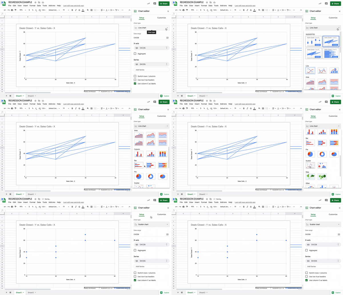
The default graph that appears isn’t what we need, so I clicked on the Chart editor tool and selected Scatter plot, as shown in the gif below.
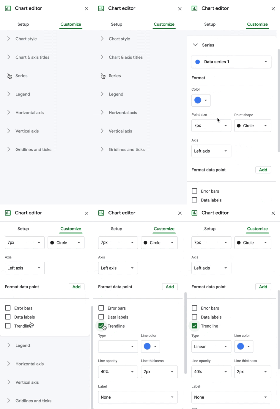
After selecting the scatter plot, I clicked Customize, Series, and scrolled down to select the Trendline box (shown below).
After all of these customizations, I get the following scatter plot.
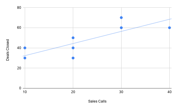
The Sheets tool did the math for me, but the line in the chart is the b variable from the regression equation, or slope, that creates the line of best fit. The blue dots are the y values, or the number of deals closed based on the number of sales calls.
values, or the number of deals closed based on the number of sales calls.
So, the scatter plot answers my overall question of whether having salespeople make more sales calls will close more deals. The answer is yes, and I know this because the line of best fit trendline is moving upwards, which indicates a positive relationship. Even though one month can have 20 sales calls and 10 deals and the next has 10 calls and 40 deals, the statistical analysis of the historical data in the table assumes that, on average, more sales calls means more deals closed.
I’m fine with this data. It means that simply having salespeople make more calls per-month than they have before will increase deal count. However, this scatter plot does not give us the specific forecast numbers that you’ll need to understand your future sales performance. Let’s use the same example to obtain that information.
Let’s say your boss tells you that they want to generate more quarterly revenue, which is directly related to sales activity. You can assume closing more deals means generating more revenue, but you still want the data to prove that having your salespeople make more calls would actually close more deals.
The built-in FORECAST.LINEAR equation in Sheets will help you understand this, based on the historical data in the first table.
I made the table below within the same sheet to create my forecast breakdown. In my Sheets document, this new table uses the same columns as the first (A, B, and C) and begins in row 26.
I went with 50 because the highest number of sales calls made in any given month from the original data table is 40 and we want to know what happens to deal totals if that number actually increases. I could’ve only used 50, but I increased the number by 10 each month to get an accurate forecast that is based on statistics, not a one-off occurrence.
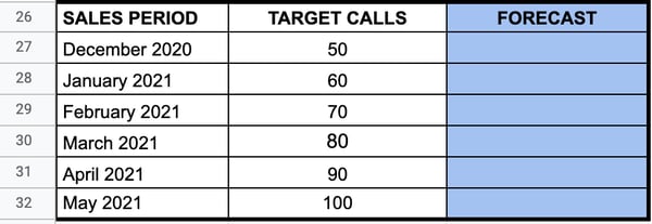
After creating this chart, I followed this path within the Insert dropdown menu in the Sheets toolbar: Insert -> Function -> Statistical -> FORECAST.LINEAR.
This part gets a little bit technical, but it’s simpler than it looks. The instruction menu below tells me that I’ll obtain my forecasts by filling in the relevant column numbers for the target number of sales calls.
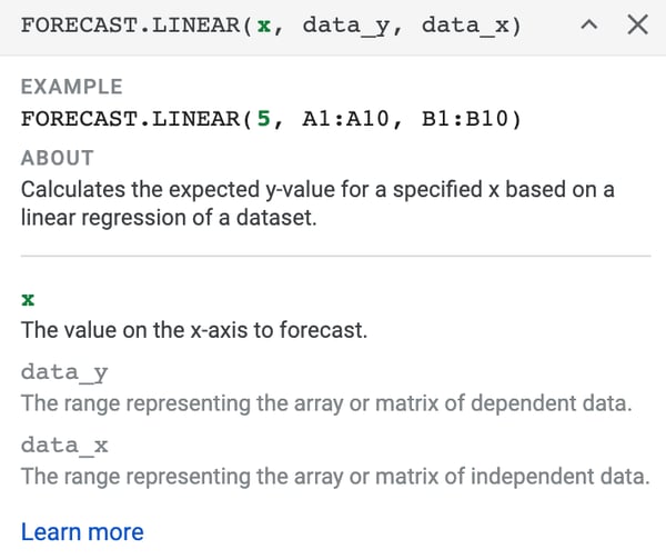
Here is the breakdown of what the elements of the FORECAST.LINEAR equation mean:
- x is the value on the x-axis (in the scatter plot) that we want to forecast, which is the target call volume.
- data_y uses the first and last row number in column C in the original table, 2 and 24.
- data_x uses the first and last row number in column B in the original table, 2 and 24.
- data_y goes before data_x because the dependent variable in column C changes because of the number in column B.
This equation, as the FORECAST.LINEAR instructions tell us, will calculate the expected y value (number of deals closed) for a specific x value based on a linear regression of the original data set. There are two ways to fill out the equation. The first option, shown below, is to manually input the x value for the number of target calls and repeat for each row.
=FORECAST.LINEAR(50, C2:C24, B2:B24)
The second option is to use the corresponding cell number for the first x value and drag the equation down to each subsequent cell. This is what the equation would look like if I used the cell number for 50 in the second data table:
=FORECAST.LINEAR(B27, C2:C24, B2:B24)
To reiterate, I use the number 50 because I want to be sure that making more sales calls results in more closed deals and more revenue, not just a random occurrence. This is what the number of deals closed would be, not rounded up to exact decimal points.
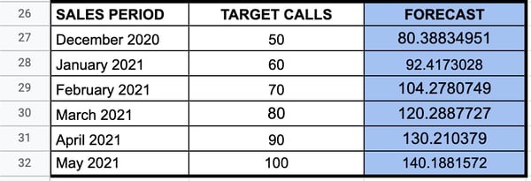
Overall, the results of this linear regression analysis and expected forecast tell me that the number of sales calls is directly related to the number of deals closed per month. If you ask your salespeople to make ten more calls per month than the previous month, the number of deals closed will increase, which will help your business generate more revenue.
While Google Sheets helped me do the math without any further calculations, other tools are available to streamline and simplify this process.
Sales Regression Forecasting Tools
A critical factor in conducting a successful regression analysis is having data and having enough data. While you can add and just use two numbers, regression requires enough data to determine if there is a significant relationship between your variables. Without enough data points, it will be challenging to run an accurate forecast. If you don’t yet have enough data, it may be best to wait until you have enough.
Once you have the data you need, the below list of tools that can help you through the process of collecting, storing, and exporting your sales data.
InsightSquared
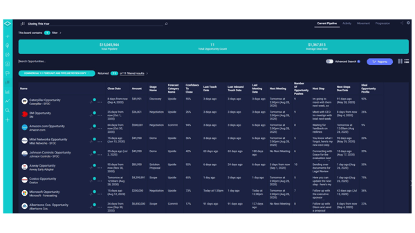
InsightSquared is a revenue intelligence platform that uses AI to make accurate forecasting predictions.
While it can’t run a regression analysis, it can give you the data you need to conduct the regression on your own. Specifically, it provides data breakdowns of the teams, representatives, and sales activities that are driving the best results. You can use this insight to come up with further questions to ask in your regression analysis to better understand performance.
MethodData
Since sorting through data is essential for beginning your analysis, MethodData is valuable tool. The service can create custom sales reports based on the variables you need for your specific regression, and the automated processes save you time. Instead digging through your data and cleaning it up enough to be usable, it happens automatically once you create your custom reports.
HubSpot Sales Hub
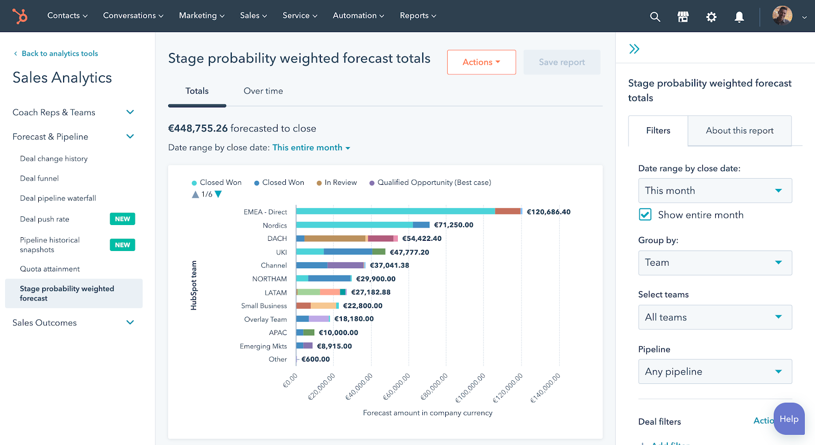
HubSpot’s Sales Hub automatically records and tracks all relevant sales and performance data related to your teams. Specific items collected include activity reports for sales calls, emails sent, and meetings taken with clients, but you can also create custom reports.
If you want an immediate overview of your sales forecast, the Sales Hub comes with a probability forecast report. It gives a breakdown of how likely it will be that you’ll meet your monthly or quarterly sales goals (shown in the image below). These projections can help you come up with further questions to analyze in your regression analysis to understand what is (or isn’t) going wrong.
Automate.io
If you’re a HubSpot Sales Hub user and you want to use Google Sheets to conduct your regression analysis as I did, Automate.io allows you to sync and export data to external apps, including Google Sheets, eliminating the risks that can sometimes come from a simple copy+paste.
Another factor that can affect your analysis is whether you’re even doing it right. Like I said before, I’m bad at math, so I used an online tool. If you feel confident enough, feel free to use a pen, paper, and a quality calculator to run your analysis by hand.
If you’re like me, using statistical analysis tools like Excel, Google Sheets, RStudio, and SPSS can help you through the process, no hard calculations required. Paired with one of the data export tools listed above, you’ll have a seamless strategy to clean and organize your data and run your linear regression analysis.
Regression Analysis Helps You Better Understand Sales Performance
A regression analysis will give you statistical insight into the factors that influence sales performance.
If you take the time to come up with a viable regression question that focuses on two business-specific variables and use the right data, you’ll be able to accurately forecast expected sales performance and understand what elements of your strategy can remain the same, or what needs to change to meet new business goals.
![]()


