Let me ask you a question…
Would you rather have a beautiful website or a website your customers love?
From a business perspective, you shouldn’t go for either.
Your answer must be 100% I want a high-converting website.
Because if people buy, then they both like it and you can safely and predictably scale your business.
Many people get in the trap of creating designs they like while their perfect client avatar is so much different than what they would imagine.
And that can be easily noticed when you click on ads you see on social media.
You might like the ad itself but most times the landing page on the other side is not what you want to see.
The connection between your traffic and your landing page is called an accurate message to market fit.
You want your message to perfectly fit your market so you can start with a winning funnel that’s only bound to go up from there.
Because if you mess up there, you would be optimizing and tweaking little components that will barely get you to break even.
But if you nail your message you would be getting customers left and right without even knowing why or how they came to you.
It’s your most powerful weapon and most businesses do it completely wrong.
So to help you out and guarantee your immediate success, we’ll be going over the best 12 landing page examples that you should use to scale your business.
We’ll go over each one’s strengths and weaknesses while making sure you find one that fits your exact business.
After this post, you’ll be able to come up with high-converting landing pages like magic.
But before we do that, we must go over…
What Makes a Great Landing Page
That question solely depends on your needs.
So let me ask you a couple of questions that will help you clear your mind and think in the right direction.
#1 What do you want to accomplish with your landing page?
Your most common options are:
- Getting people to opt-in in exchange for Free value on a subject
- Directly selling a low-ticket product like a book or a mini-course
- Free Trial offer for a monthly service or software
- Free + Shipping offer where you count on upsells to make a profit
You’ve got to know exactly what offer you want to present in your landing page before creating it.
And of course, there are other offers you can make but the idea here is to clarify what is the one that you want to use for your business.
If you’re not sure, there would be multiple examples further down the post.
Now for the next question, you need to ask yourself…
#2 Are you committed to this project or are you just trying out an offer?
Building a high-converting landing page is not an overnight hustle.
You might find yourself optimizing a non-profitable landing page for months before it starts generating real returns.
And if you’re not ready for that, then I recommend you quit before you even start.
Yes, you can get a lucky shot and hit a homerun from your first try but counting on it is delusional.
Be ready for the long game so you catch the long-term gains that are so much sweeter than the momentary satisfaction.
And for the final question…
#3 What’s your budget?
Before you begin designing your high-converting landing page, you need to prepare a solid budget.
You can’t expect everything to go smoothly throughout the process.
Problems are going to occur and most times the easiest and fastest way to solve them is to pay someone who is an expert in the field.
That can be a developer, a Funnel designer/builder, an Ad specialist, or a CRO consultant.
Either way, you should be ready to pay someone to do it right so you don’t face the same problems over and over.
In marketing and life, there’s a rule of thumb that suggests you should finish your work and then let someone else judge it.
Obviously, for landing pages, the way is to run some ads and see if the traffic converts.
If it does, you raise your ad budget and try to scale.
If it doesn’t convert initially then you should let a professional take a look at it.
And even if you already hired someone to build it for you, don’t expect him to help you here.
Yes, he can optimize your page but you’ve got to keep in mind that people have an emotional attachment to their work.
That’s why you need a third party to help you out.
And especially when it comes to optimizing a landing page for conversions, you must consider the idea of hiring an agency.
Big marketing agencies nowadays have had hundreds if not thousands of clients who had been in your exact situation.
That’s why hiring a marketing agency to help you increase your conversion is the best bet.
And talking about CRO (conversion rate optimization) there’s no better choice than NP Digital.
It is simply the best marketing agency for both SEO and CRO.
If you’re at the stage where you want to optimize your existing landing page but you don’t know exactly how to do it…
Then you should book a quick call with a professional where you’ll unravel the secret conversion optimization methods your business needs.
And now for the main event…
The Best 12 Landing Page Examples
These are the 12 Best Landing Page Examples we could find.
We’ll be judging them for conversions, offer, design, and customer experience.
#1 Get Response
Get Response is an example of a simple yet interactive landing page example.
You can see the Get Response team are bold as they’re the only software in the industry that uses an interactive headline.
The yellow sign you see on the image below changes between the words growing, leads, and sales.
That makes it for a great attention-grabbing headline that just makes you read on.
Also, they use a friendly, positive face which is something we don’t see very often in business that is not centered around a personal brand.
That of course is not a bad thing. It automatically builds trust and makes it easier for people to sign up for their software.
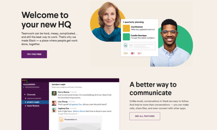
#2 Slack
Slack is always on the top of its game when it comes to landing pages.
They are constantly optimizing for conversions and that’s the best way to find your winning landing page.
Their current one is once again, extremely interactive, has a big eye-popping headline, and also shows how easy it is to use the software with a quick 5-second giff.
Straight from the get-go, you can see they value customer satisfaction and if you’re still not sure, scrolling down will lead to non-stop credibility and results that prove their authority in the marketplace.
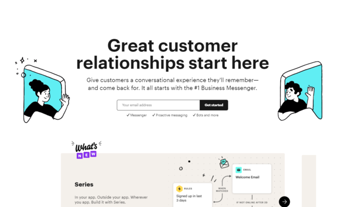
#3 Intercom
Intercom’s main objective on this landing page is to get you to opt-in with your email.
Keeping it to email only is a great way to increase your opt-in rate.
A big, positive headline that puts you in the right state of mind to act now.
The images they use perfectly represent the headline’s main USP.
You can see an overall friendly environment and you just have to opt-in if you got to this page.
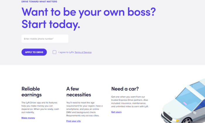
#4 Lyft
Lyft has been riding up the charts in the past years and their website, landing page, and their overall online funnel is not lacking behind.
They focus on attracting new drivers that want to control their own life.
And promising your employees freedom while working for you is the best way to snap the best candidates from your competitors.
We know Lyft has used multiple landing pages in the past but their current one shows real professionalism.
Once again, we see a giant, attention-grabbing headline. This time with a question to anticipate curiosity and thought process in their prospects.
And check out the button “APPLY TO DRIVE”. It implies that it’s not 100% sure you’ll be able to get the position.
Making it so your clients have to compete to get a hold of your attention makes it so they try harder in the job itself.
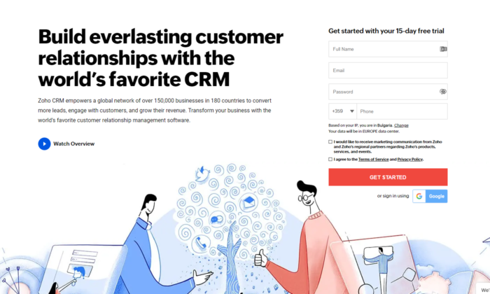
#5 Zoho
Zoho’s landing page is a great example of a more complicated but still extremely powerful messaging.
They use more text than the average software in the industry but that’s not necessarily bad.
For their specific case, they need to convert the prospect to begin a free trial which automatically builds tension in a prospect because he knows it will come a time he’d have to pay.
And converting someone to pay is way harder than just getting their email.
That’s why using more text in their messaging makes it for a powerful copywriting punch that maximizes free-trial registrations.
#6 Squarespace
Squarespace tops the list for the least amount of text in their landing page design.
At first, you may think that is not enough to convert someone.
But once you see that they’re a website builder you can see how the design and the quick and powerful messaging are all you need to sign-up.
They know their prospects mainly struggle with complicated codes and want to show a safe space where they can relax and drag and drop their winning website design.
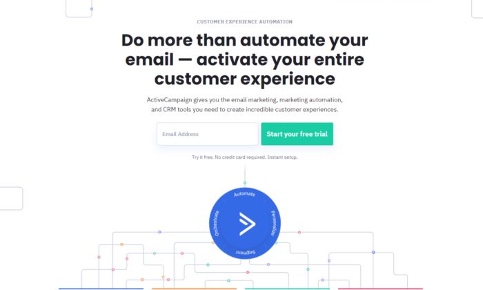
#7 ActiveCampaign
ActiveCampaign solely focuses on showing you how their software brings the best customer experience possible.
And if you’re a business owner, you both want to be treated well and want to help your customers in tough times.
Their headline hits 2 birds with one stone and once again there’s no useless text or design.
Everything leads to the big green button and you starting your free trial.
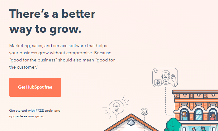
#8 Hubspot
Hubspot is one more CRM that tops out the list today.
They, just like ActiveCampaign, show you that using their software will both help you and your customers feel better throughout the process.
Knowing that their ideal customer’s main objection is that learning a whole new CRM from scratch might be hard, tedious, and maybe even impossible, helps them narrow their message straight to the point.
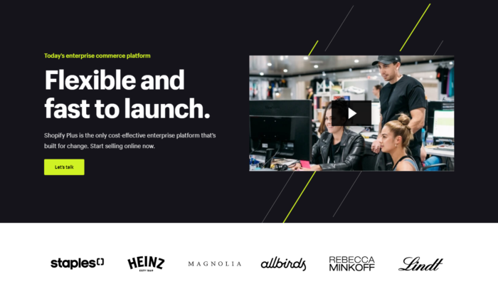
#9 Shopify Plus
Shopify is one of the most well-known platforms in today’s online space and they know it.
As they’ve been rapidly growing throughout the years, they’ve been able to test out multiple landing page designs to find one that converts.
And the Shopify Plus’s landing page shows for it.
Their main goal is to book a consultation call with their prospects which takes more than just a couple of words.
They have the budget to shoot professional videos for all of their products and services which helps transfer valuable information to their prospects in the fastest possible way — video.
Down below you see powerful credibility and if you take the time to watch the video, you’re most likely going to book a call with them.
Videos are a deadly weapon in the right business’s hands and Shopify proves that here and pretty much with anything they do.
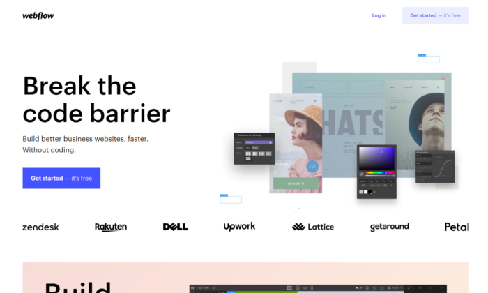
#10 Webflow
Webflow shows the insights of the software immediately when you land on their landing page.
You can see instant credibility from big websites that have used their services and also you can begin for free.
That breaks any tension the prospect might have.
On top of that, you can see that their software is similar to Photoshop.
So if you’ve ever used Adobe’s products, you immediately know this work will be a piece of cake for you.
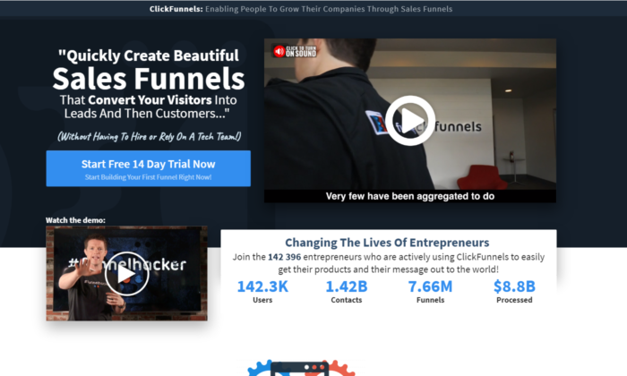
#11 ClickFunnels
ClickFunnels uses its software to convert you for a free trial.
And even if you have any skepticism you can play around with the funnel pages and buttons to see the responsiveness of nowadays funnels.
You can see that they use more text than the average website/funnel builder.
But once again they’re trying to convert people to start a 14-day free trial which is not an easy task.
They also use powerful videos that sell directly to their ideal customers.
And the best part is the analytics they’ve slapped on their landing page.
It’s a bold and powerful move if done correctly.
The way these analytics are crafted makes it so they are constantly being updated and it’s not just 100K+ users as you might see on other platforms.
ClickFunnels values its customer’s success stories and is always there to record each result.
It’s one of the harder landing page designs to pull off but if you do it, your conversions will skyrocket.
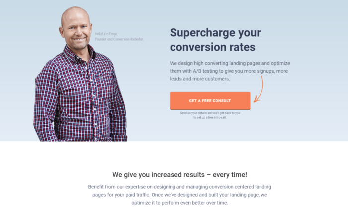
#12 Conversion Lab
Conversion Lab has been using this landing page design for years now.
We’ve noticed they split test different button CTA-s like book a call, get a free consult, and many more.
Keeping their Founder on the main page of the website builds a long-term relationship many businesses nowadays miss out on.
They clearly state their services through their persuasive headline and even if you’re not ready to book a consultation call with them, a pop-up will appear collecting your email.
Email follow-up is a great way to ensure that a high percentage of prospects that land on your website will end up booking a call with you.
That is all for our list today.
To conclude what you need to know when building your landing page…
- Find what your best customers struggle the most with and then directly destroy this objection with a short and punchy headline.
- Use credibility and videos if possible.
- Know your goals — Is it to get their email, phone, ook a call, start a free/paid trial, or something else?
- Clear and easy to follow Call to Action
And always, always optimize in the process.
You can NOT be perfect from day one. Every business on this list tests their pages dozens if not hundreds of times before concluding a winner.
And even then, they still optimize.
Have you tried building a landing page before? How’d it go — did it convert well and what were your biggest breakthroughs when doing it?
The post 12 Best Landing Page Examples appeared first on Neil Patel.